E-commerce Case Study

ONLINE HEADSHOP REDESIGN
OVERVIEW
Partnered with a specialty eCommerce brand to resolve declining conversions, rising returns, and site usability issues. The result was a streamlined, higher-converting site built to support long-term growth.
PROJECT SCOPE
August 1st, 2023 - November 1st, 2023
ABOUT THE CLIENT
This client, a leading brand in the online headshop space, had enjoyed several years of steady growth. But as their online store scaled, cracks began to show. Return rates were increasing. Conversion rates were declining. Customer complaints were piling up. Internally, the team found themselves in constant debate over site structure and user flow—resulting in a confusing and inefficient shopping experience.
They partnered with us to identify and remove these friction points, with the goal of creating a scalable, high-converting eCommerce experience that didn’t compromise brand identity.
TOOLS
My Role
As the project lead, I oversaw the strategy, execution, and iteration of the engagement from end to end. I conducted the initial UX audit, defined the testing roadmap, and led cross-functional collaboration across design, analytics, and development.
Data Analysis: I analyzed historical GA4/UA data and behavioral tools (heatmaps, session recordings, exit surveys) to identify high-friction points in the user journey and diagnose funnel drop-offs.
UX & UI Design: I translated research insights into actionable design improvements, including product spec clarity, FAQ enhancements, and the creation of a dynamic preset filter UI tailored for mobile-first behavior.
Experimentation Strategy: I owned the A/B testing framework—developing hypotheses, defining success metrics (RPV, AOV, Transactions), and designing experiment variants grounded in behavioral and industry research.
Implementation & QA: While a developer implemented the variant logic using Google Tag Manager and custom JavaScript, I was responsible for final QA and deployment. I pushed the experiment live using custom-coded configurations to run an A/B split test directly on the live Shopify theme.
Throughout the project, I maintained oversight of testing cadence, measurement integrity, and iterative rollout based on results—ensuring each change was both technically sound and user-centered.


First 90 Days…
+11%
Revenue Per Visitor
-41%
Decreased Returns
+40%
Gross Sales
+6%
Average Order Value
+15%
Conversion Rate
+23%
Add-To-Cart Rate
NOTE: This case study captures a focused chapter within a broader client engagement, highlighting the methodology we applied and demonstrating how targeted UX and CRO improvements can drive measurable impact on bottom-line revenue.
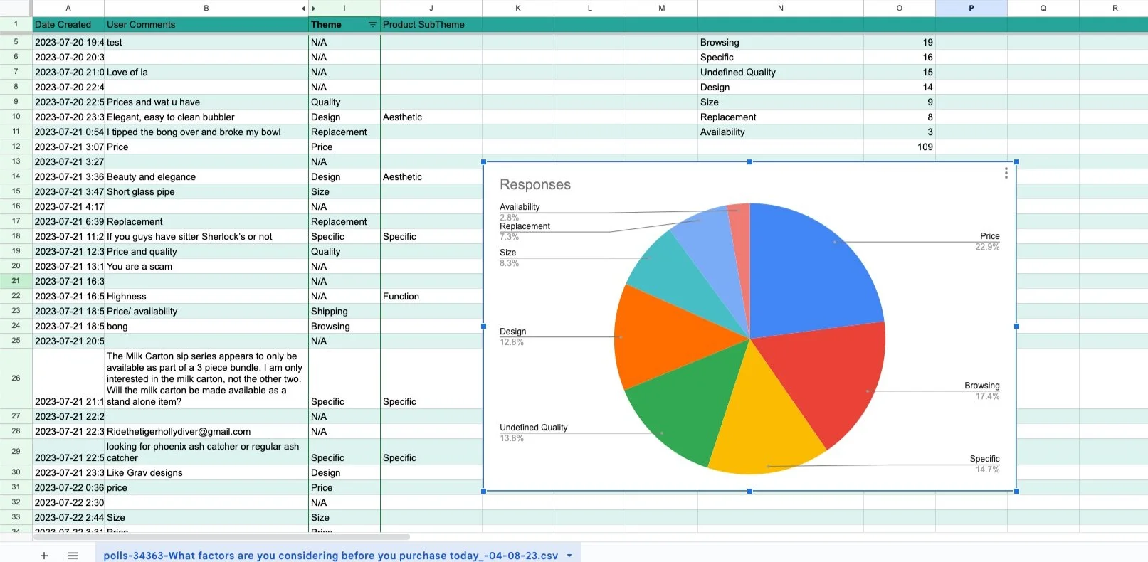
Due to advertising restrictions in the headshop space, the client relied on organic, direct, and referral traffic. We first began by analyzing the funnel. We learned that users over 70% of users were on mobile, using safari or chrome. As we chiseled away at our user’s technical descriptions, it allowed us to analyze their user journey and shape how we should frame our experience through the site. This meant utilizing a mix of apple and android devicecs through platforms like Browserstack, to see how exactly how the site performed for users.


GA4 data shows our audience is primarily mobile users Safari & Chrome.
Eventually our users began to take shape and we had an understanding of the clients primarily funnel:
Users primarily enter the site through 3 high-volume traffic channels
Over 70% utilize mobile devices
Optimizing the site for Chrome and Safari is most important
Users enter through product pages or collections (e.g., Bongs, Bubblers, Handpipes)
Mostly male users with interests in politics, gaming and technology
84% of users didn’t click add-to-cart (confidential data redacted)
Now that we understand a little more about the user, we could analyze the site from their perspective. This led us to our first discovery. Our primary user groups and nearly 84% of all site traffic, visited product pages without adding a single product.
Even further, this showed a -5% decline year-over-year. These signals pointed to a major bottleneck in the product discovery and conversion experience.
We needed to dig deeper. What was causing this bottle-neck?
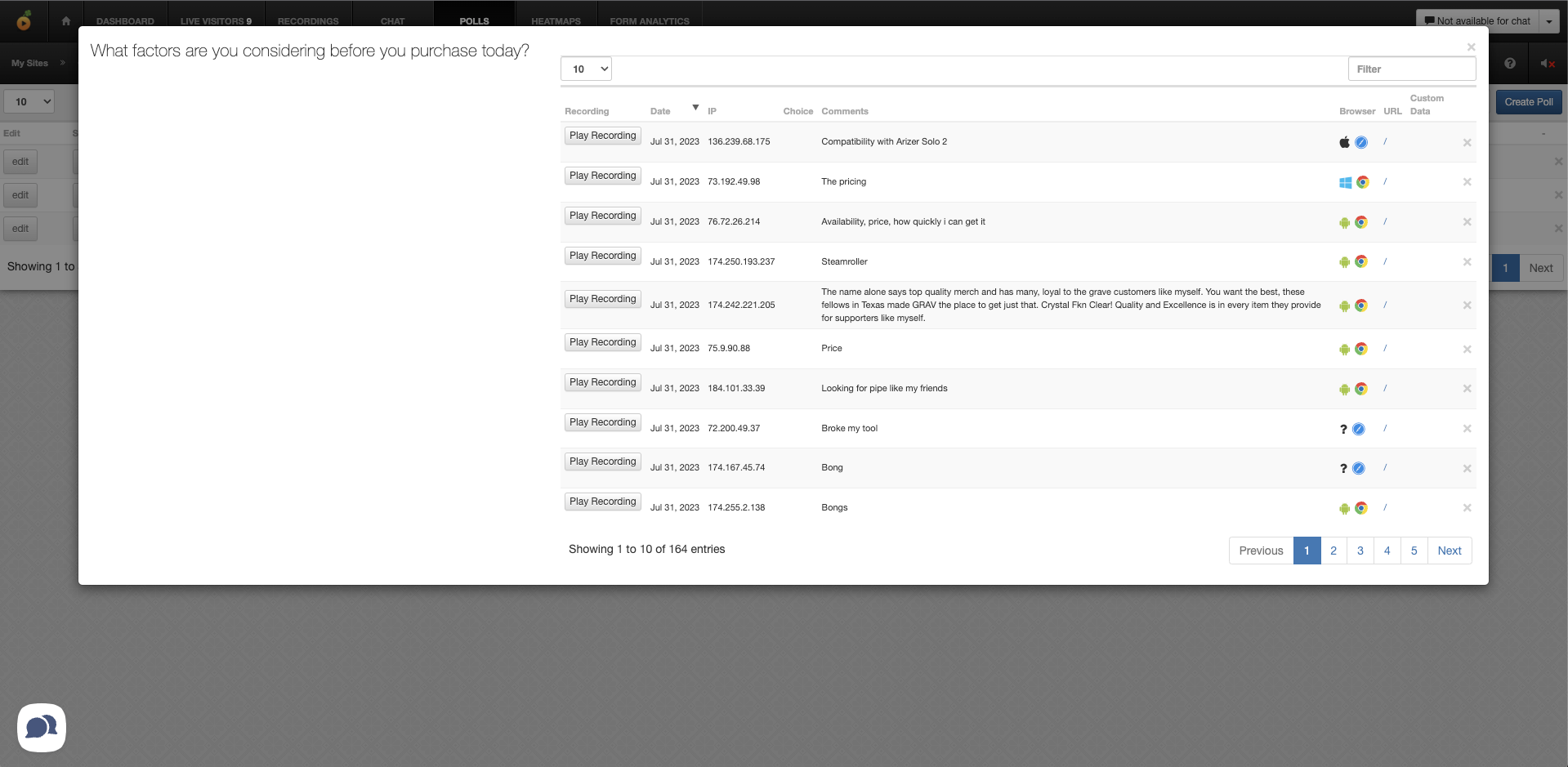
GA4 Path Exploration (confidential data redacted)
01 | FUNNEL ANALYSIS

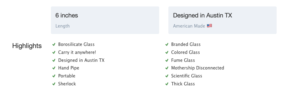
Unusually high engagement with the "Specs" tab on product pages
Heatmaps showed unusually high engagement with the "Specs" tab on product pages—but users were still exiting without converting. This indicated a crucial piece of information that may be missing from the user journey, but without asking users directly, we could only speculate.

Product A Example

Product B Example
HEATMAPPING
Products were difficult to find when shopping for size, compatability or replacement parts.

Example Product Specs
Example Product Specs
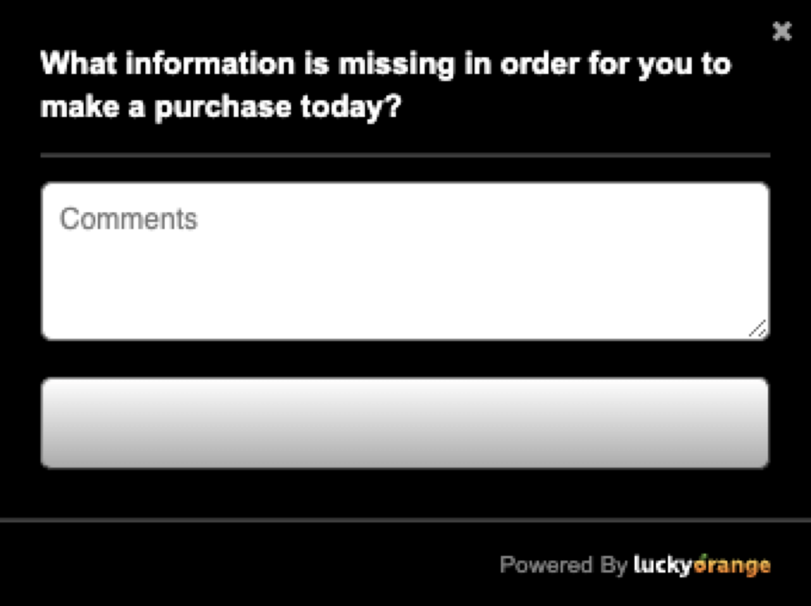
We deployed 3 surveys throughout various stages of the funnel in an attempt to learn what was bringing users to the site , why they stayed, and what incited them to leave.
Below are a few examples of the surveys shown.
Appeared on popular landing pages:
“If you didn’t find what you were looking for, what was missing?”
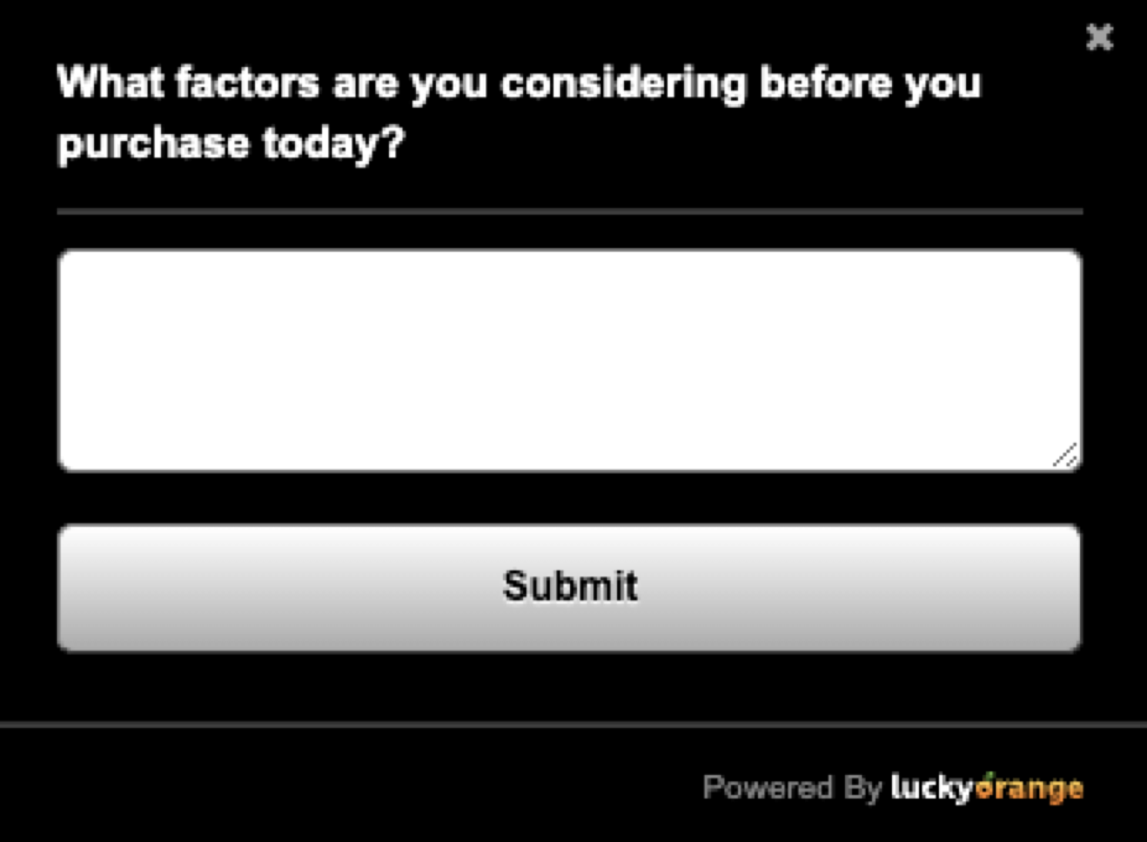
On exit-intent:
“What information is missing in order for you to make a purchase today?”
Post-checkout:
“Why did you choose to buy from [Client’s site] today?” (post-checkout)

Comparing users expectations, points of friction, and converting factors, would ultimately allow us to identify what information was missing from the product pages.
Over the next 2 weeks, we carefully analyzed session data throughout the 2 weeks of surveys. Meticulously following users who displayed the same pattern of behavior we identified in analytics.

After nearly 1000+ responses were recorded, we distilled the data into actionable insights, looking for recurring themes and specific language in user’s responses. This case study only covers a small portion of the learnings uncovered from this research.
Results
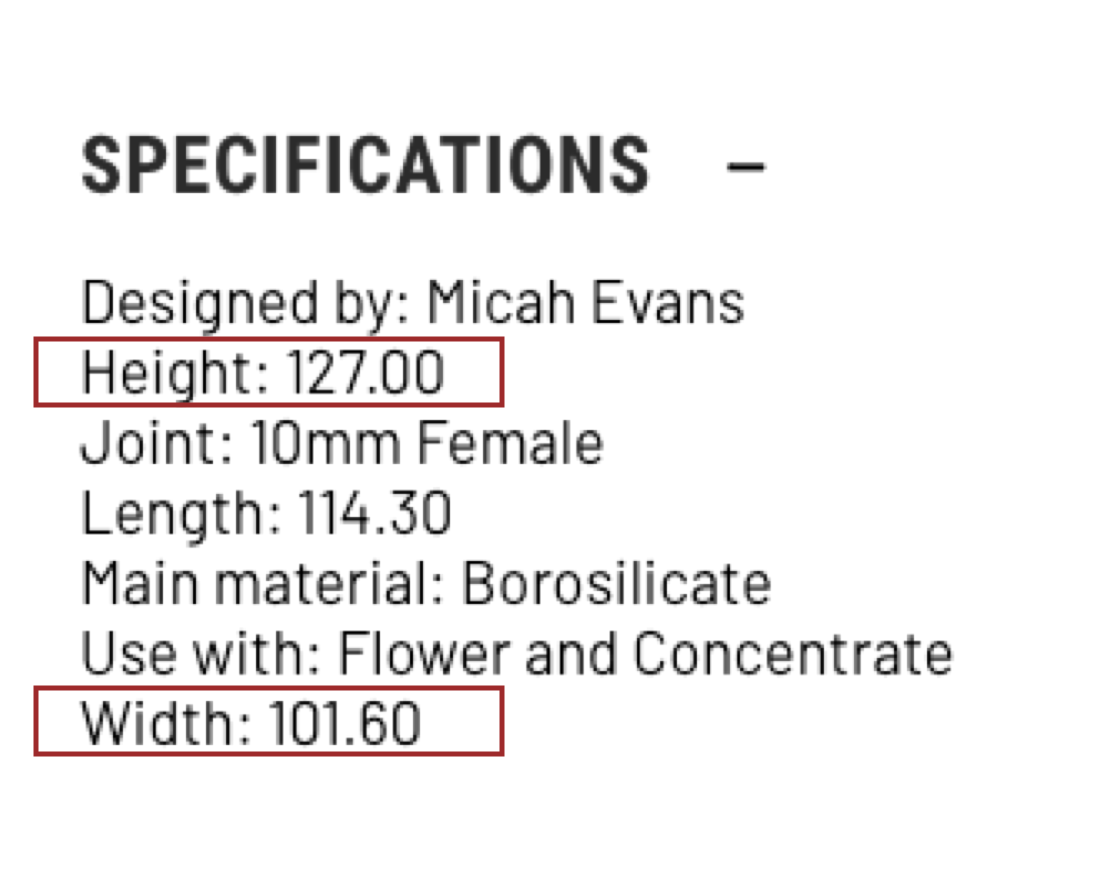
As we concluded the post-intent survey, we made a surprising discovery. Nearly 47.4% of all users left product pages due to missing or unclear sizing information.

A manual audit revealed 90%+ of product pages included numeric specs without units (e.g., “127.00” with no context).
And when we tried to browse products by size, we discovered the size tags hadn’t been updated in years and it was nearly impossible to find products by size or compatibility.

USER SURVEYS
BENCHMARKING
As we uncovered more information about this problem, we found this was a widespread issue across special interest stores. In 2023, Baymard Institute discovered most sites involving technical or special interest products relied heavily on product specs but a over 50% of online stores failed to do this properly.
Including updated size and product measurements, was a massive, untapped opportunity to both fix a usability issue and outperform the competition in area that mattered to users.

Baymard Institute. (n.d.). How to Improve the Scannability of the Product spec sheet. (Guideline #835). Baymard Premium. https://baymard.com/premium/guideline-collections/kd1sku/835

Baymard Institute. (n.d.). Provide Core Product Info Both in the Product Description and Specifications (Guideline #858). Baymard Premium. https://baymard.com/premium/guideline-collections/kd1sku/858

Baymard Institute. (n.d.). Always Append the “Unit of Measure” to All Numerical Value Specifications (Guideline #857). Baymard Premium. https://baymard.com/premium/guideline-collections/kd1sku/857

Baymard Institute. (n.d.). Explain and Define Most Specification Labels (Guideline #840). Baymard Premium. https://baymard.com/premium/guideline-collections/kd1sku/840
Now that we understood the primary issue user’s were facing, it’s revenue impact, and how this issue has been discovered and address before, we were ready to distill these learnings into actionable insights.
We focused on high-impact, low-effort improvements first:Opened the Specs section by default on PDPs
Standardized product dimensions with imperial units (inches).

Audited and cleaned size filter taxonomy

Re-tagged all products with proper size metadata

Highlight product size through lifestyle photos and perspective shots.

Solutions Implemented
FINAL RESULTS
Over the next two years, we worked alongside the client to support strategic initiatives, including:
+11%
Revenue Per Visitor
-41%
Decreased Returns
+40%
Gross Sales
+6%
Average Order Value
Extended Work
2023-2025
Full-Site Redesign (2024)
Rethemed Shopify site in 2024, facilitating full project
Product Page Enhancements
Integrated reviews, specs, FAQs
Loyalty & Rewards Program (2025)
Identified and built out recurring revenue opportunities
Introduced tiered rewards with clear value comms
Upsells & Cross-Sells (2025)
Introduced on-cart and post-purchase bundles
+15%
Conversion Rate
+23%
Add-To-Cart Rate
Data Sources and Setup
GA4 event tagging: Custom event tags tracked filter interactions, product card impressions, PDP views, ATC clicks, transactions, and revenue per session.
Heatmaps & session recordings (via Hotjar) were used to validate behavioral assumptions.
Preset filters were selected using:
90-day interaction data
Transaction volume per filter path
Bounce rate correlations from collection pages
Test Duration & Sample Size
Duration: 3 weeks
Sample size: ~50,000 sessions (split evenly 50/50 control vs. variant)
Device Split: 90% mobile, 10% desktop (consistent with baseline traffic)
Outcomes & Learnings

Example of Promoted Filters


Variation B Performance (vs. Control):
+8.48% Revenue Per Visitor (95% Confidence)
+5.54% Average Order Value (85% Confidence)
+4.4% Transactions (91% Confidence)
−2.7% PDP Views & ATC Clicks (99% Confidence)
Key Insight:
The drop in PDP views and ATC events per session indicated that users were spending less time exploring irrelevant options. Instead, they were landing on better-matched products from the outset—likely due to the pre-applied filters anticipating their intent.
Next Steps
Rolled out preset filter UI globally across all top-level collection pages.
Developed logic to refresh filters dynamically every 60 days based on behavioral shifts.
Added tagging layer to track preset filter performance vs. manually selected filters.
EXPERIMENTATION
Now that users were easily finding the product info they needed and easily able to filter by qualifying features like size, we explored how to better guide these users to the right products.
Data showed users who used the updated filters converted 181% more.
Industry benchmarks showed only 30% of competitors promoted filters, despite research showing they increased purchase rates.
A large portion of all revenue went through the Collection pages
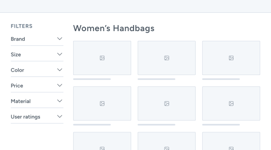
Standard Collection Page

Hypothesis Creation
We hypothesized that users would convert at a higher rate if we surfaced the most commonly used filter combinations upfront—reducing cognitive load and shortening the discovery process.
“If we decrease the steps needed to find the products users want, by showing users pre-populated filter buttons (based on historical usage patterns), then we will increase add-to-cart rate rate and revenue per visitor.”
Our goal with this experiment would be:
Surfacing the most relevant product subsets faster
Reducing the time spent browsing irrelevant items
Decreasing friction for mobile users by minimizing the need for multi-tap filtering”
Test Setup
Platform: Shopify 2.0 with custom theme development
Testing Tool: Google Optimize (deprecated during test → migrated to custom server-side logic and tracked via GA4 + Looker Studio dashboards)
Primary Metric:
Add-to-Cart Rate
Secondary Metrics:
Checkout Starts
Revenue per visitor (RPV)
Average Order Value (AOV)
Transactions
Product Detail Page Views
Variant Creation
Control (Variant A): Standard filter experience — collapsible filter menu with no default filter selections. Users had to manually open and apply all filters.
Variation (Variant B):
Displayed a horizontal strip of preset filter "chips" at the top of the collection pages.
These presets were dynamically generated from the most frequent filter combinations over the past 90 days (e.g., “Mini Size + Glass + Best Sellers” or “Beaker Style + 14mm + $50–$100”).
Presets adjusted based on collection context (e.g., pipe collections showed different presets than accessories).
Fully mobile-optimized with swipe functionality and “clear filter” microinteractions.


THE “TLDR”
🔍 Analysis
Conducted a full-site UX audit, focusing on mobile (90%+ of traffic).
Analyzed GA/UA data and heatmaps to identify friction points in the product discovery and purchase funnel.
Flagged a major drop in Add-to-Cart rates on product pages and identified missing size context as a likely cause.
Benchmarked industry standards using Baymard and competitor audits to validate usability gaps.
🎨 Design & UX
Standardized product specs with clear units (inches), opened “Specs” tab by default.
Audited and fixed product filters; updated taxonomy and re-tagged products for accuracy.
Designed new FAQ and microcopy components to help users quickly understand product use and sizing.
Created a preset filter UI for collection pages to surface popular filter combinations on mobile.
👂 User Research
Deployed targeted exit-intent surveys on PDPs and collection pages.
Found that 47.4% of users left product pages due to missing or unclear sizing information.
Cross-validated findings with session recordings and click maps showing high engagement with the "Specs" tab.
Identified additional confusion caused by inconsistent filter tagging and poor mobile discoverability.
🧪 Testing
A/B tested the new preset filter module over 3 weeks (~50,000 sessions).
Used GA4, Looker Studio, and Hotjar to track RPV, AOV, transactions, and behavioral patterns.
Achieved strong uplifts across RPV (+8.48%), AOV (+5.54%), and Transactions (+4.4%), with fewer unnecessary PDP and ATC interactions (−2.7%).
🚀 Implementation
Rolled out product spec fixes and filter updates across the entire catalog.
Deployed preset filters across top-level collections with dynamic logic to refresh based on live behavior.
Supported a full homepage and PDP redesign in 2024.
Introduced loyalty program and upsell strategies, informed by ongoing analytics and testing.