IMPROVING BUYER CONFIDENCE AT GRAV

GRAV.COM
OVERVIEW
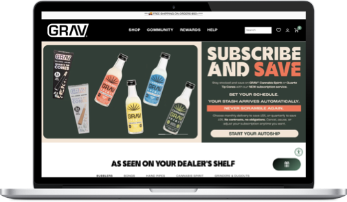
GRAV is a DTC eCommerce brand. I partnered with stakeholders and developers to improve the end-to-end shopping experience (especially PDP → add-to-cart → checkout) using a mix of user research, behavioral analytics, and rapid iteration.
To ground decisions in real customer language, we ran large-scale qualitative research (nearly 1000+ responses) and distilled the findings into repeatable themes that could translate into design + experimentation opportunities.
PROJECT SCOPE
2023 - 2025
TL;DR
PROBLEM
Despite strong traffic and brand loyalty, many users struggled to find the right products and confidently commit, especially when arriving with specific intent or evaluating size, compatibility, and replacements.
APPROACH
Over a two-year engagement, I treated navigation, taxonomy, PDP clarity, and loyalty signaling as a connected system. I used research, benchmarks, and experimentation to reduce findability and confidence friction for high-intent and returning users.
WHAT I DID
Optimized the experience for users who arrived with a specific product or replacement in mind
Restructured site taxonomy and navigation to align with real user language and search behavior
Improved PDP clarity around size, compatibility, and use cases
Used loyalty and warranty signals to reinforce confidence for returning users
Shipped changes incrementally through ongoing experimentation rather than a single redesign
IMPACT
This approach led to sustained improvements in add-to-cart behavior, conversion, average order value, and revenue per visitor, without increasing reliance on promotions or discounts.
WHY IT MATTERS
The gains held over time, indicating the work addressed structural product issues rather than short-term optimizations.
TOOLS


INDEX:
01. Role / Team / Timeline / Constraints
02. Context → Problem → Why it matters
03. Signals (quant + qual) → Key insight(s)
04. Hypotheses & Experiments
05. Key decisions
06. Results & What Shipped
NOTE: This case study captures a focused chapter within a broader client engagement, highlighting the methodology I applied and demonstrating how targeted UX and CRO improvements can drive measurable impact on bottom-line revenue.
01 | ROLE / TEAM / TIMELINE / CONSTRAINTS
ROLE
Owned the end-to-end discovery, design, and experimentation strategy across GRAV’s PDP, cart, and merchandising experience, with accountability for identifying conversion bottlenecks, defining hypotheses, designing solutions, and measuring impact.
TEAM
Client: GRAV internal marketing and eCommerce stakeholders
Cross-functional collaboration: Engineering, analytics, merchandising
My responsibility: Translate behavioral and qualitative insights into testable product changes, align stakeholders on priorities, and guide implementation through QA and launch
TIMELINE
Initial engagement: August 2023 - November 2023
Active optimization period: Ongoing, multi-quarter program
Work was intentionally iterative, with improvements shipped, tested, refined, and expanded over time rather than treated as a single redesign
CONSTRAINTS
High SKU overlap: Many products appeared visually similar but differed meaningfully in function and price, increasing decision friction
Mixed audiences: Experience needed to support both DTC shoppers and wholesale buyers without fragmenting the UI
Brand sensitivity: GRAV’s strong visual identity limited how aggressively layouts and hierarchy could change
Testing limitations: Certain high-traffic templates required phased rollouts to minimize risk while still generating statistically meaningful results
02 | CONTEXT → PROBLEM → WHY IT MATTERS
CONTEXT
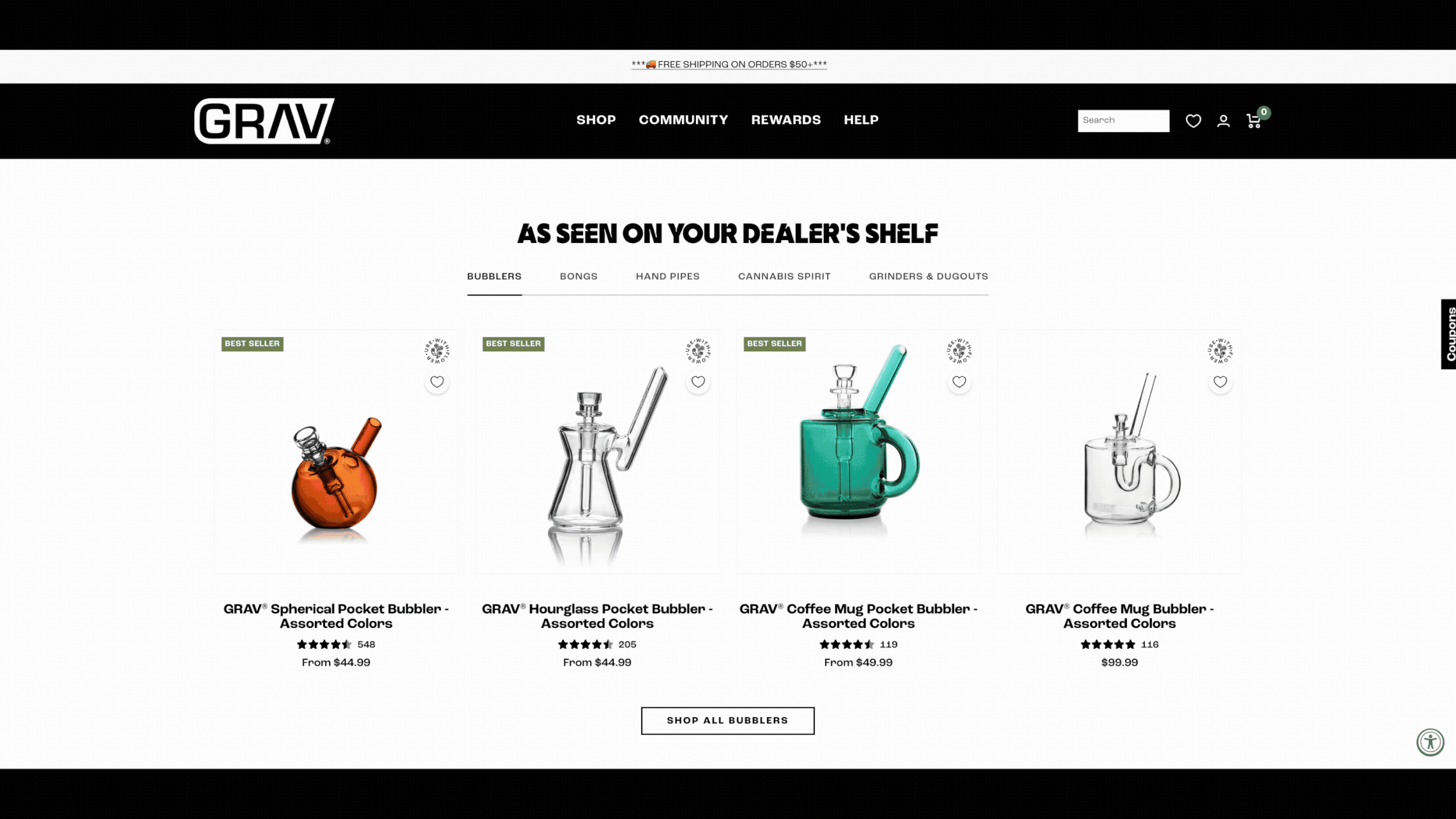
GRAV is a high-growth eCommerce brand with a large catalog of visually similar products that differ in subtle but important ways (size, function, compatibility, price). As the product line expanded, the site increasingly relied on PDPs to do the heavy lifting of education, comparison, and decision-making.
While traffic continued to grow, performance across core PDP metrics began to stagnate, signaling that acquisition was outpacing the site’s ability to help users confidently choose the right product.
PROBLEM
Behavioral data showed that 84% of users were reaching product detail pages without adding a product to cart, and that trend was worsening year-over-year.
Further analysis revealed that users weren’t bouncing immediately, they were scrolling, switching between products, and hesitating. This indicated that the issue wasn’t product interest, but decision friction caused by unclear differentiation, inconsistent hierarchy, and cognitive overload at the point of commitment.
WHY IT MATTERED
This friction had compounding effects:
Users delayed or abandoned purchase decisions
Shoppers defaulted to lower-priced items when uncertain, suppressing AOV
Incorrect product selection increased downstream returns and support burden
Wholesale buyers struggled to quickly validate they were choosing the correct SKUs
Left unaddressed, PDP hesitation threatened to cap revenue growth even as marketing efficiency and traffic improved making this a product experience problem, not a marketing one.
Solving it required more than visual polish; it demanded a structured experimentation approach focused on improving clarity, confidence, and commitment at the most critical moment in the funnel.
03 | SIGNALS & INSIGHTS (HOW WE KNEW)
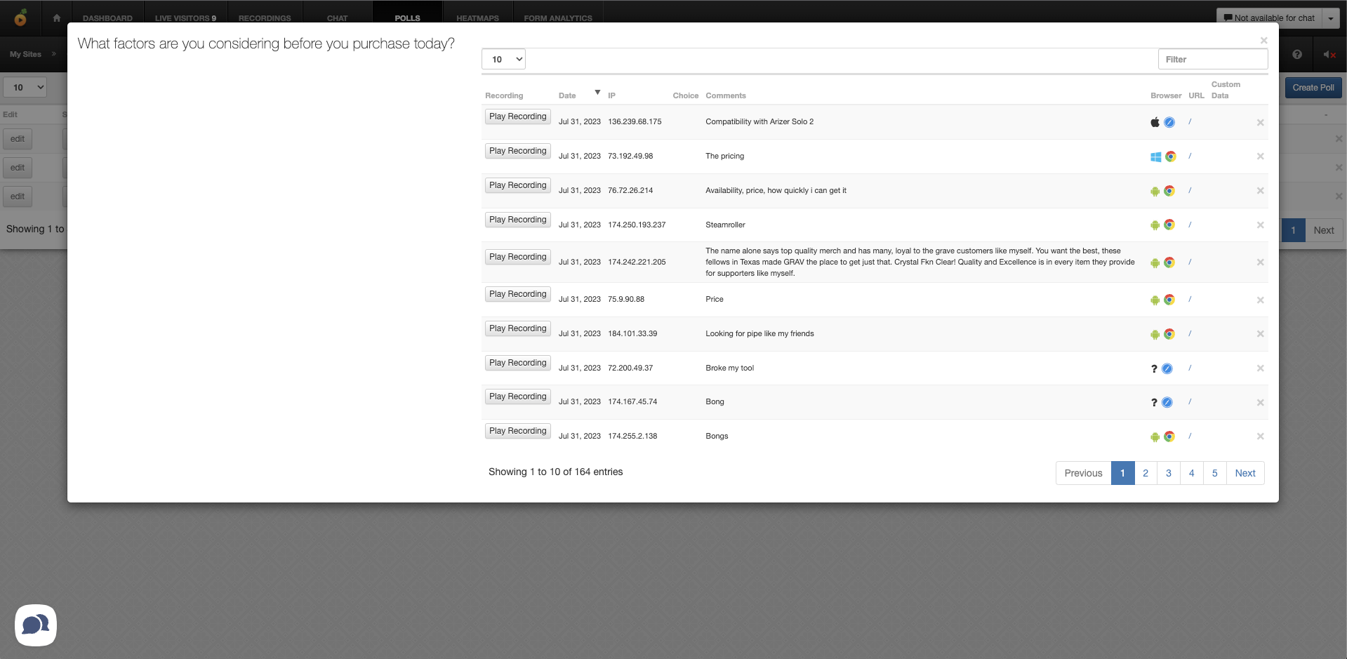
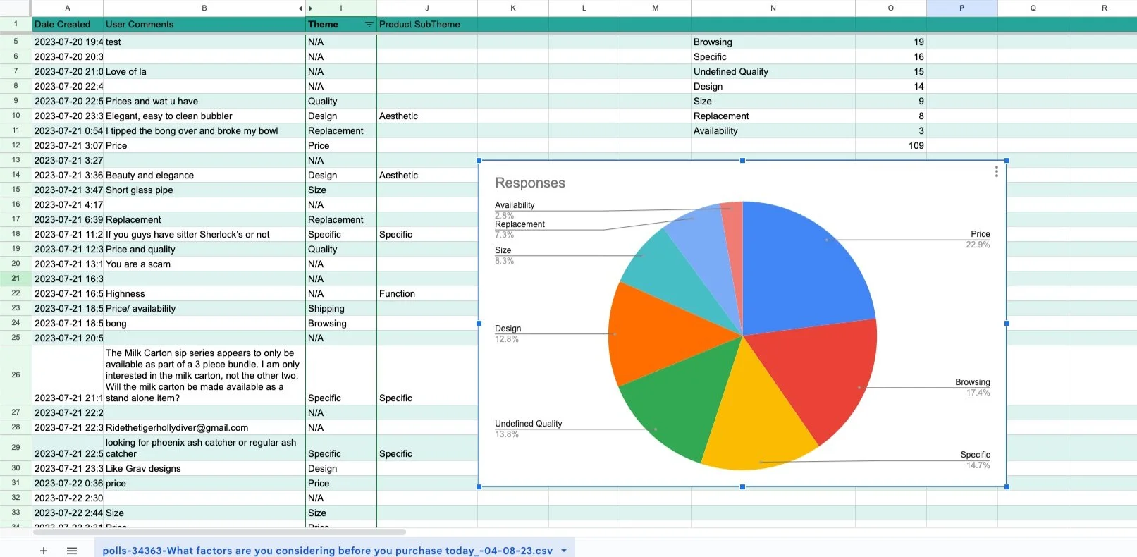
To understand why users were reaching PDPs but hesitating to commit, I combined quantitative behavioral data with qualitative user feedback to isolate where and why confidence was breaking down.
QUANTITATIVE INSIGHTS
84% of PDP visitors did not add a product to cart, despite healthy traffic and engagement
Users frequently viewed multiple similar PDPs in a single session, indicating comparison behavior without resolution
Scroll depth was high, but interaction with key decision elements (variants, specs, add-to-cart) dropped sharply after initial exposure
Higher-priced products showed disproportionately lower add-to-cart rates, suggesting uncertainty suppressed willingness to commit (an issue with price is an issue quality)
These patterns pointed to a decision bottleneck, not a traffic or relevance problem.

Funnel Analysis Using Google Analytics 4
QUALITATIVE INSIGHTS
To validate what the behavioral data suggested, I reviewed and synthesized:
On-site survey responses
Customer feedback and support themes
Session recordings and usability observations
Common themes emerged:
Users struggled to quickly understand how products differed
Shoppers were unsure which product best matched their use case
Terminology and specifications were often scanned but not absorbed
Users expressed fear of “choosing the wrong one,” leading to hesitation or exit

KEY INSIGHT
The core issue was a lack of confidence.
Users were motivated enough to browse deeply, but the PDP experience wasn’t doing enough to:
Clarify meaningful differences
Reduce cognitive load
Reinforce that they were making the right choice
This insight reframed the opportunity:
Success would come not from pushing users harder to convert, but from designing clarity and reassurance directly into the decision moment.
These signals allowed me to:
Define testable hypotheses focused on clarity and confidence
Prioritize PDP changes over top-of-funnel acquisition
Evaluate success using add-to-cart behavior, AOV, and downstream outcomes — not just clicks
04 | HYPOTHESIS & EXPERIMENTS
Based on behavioral data, survey responses, and qualitative insights, I reframed the work around a more specific core question:
How might we reduce friction for users who arrive with clear intent by improving findability, clarity, and confidence across the PDP and surrounding funnel?
Rather than pursuing a single redesign, I structured the work as a series of evidence-backed hypotheses, each focused on a known point of friction and tested iteratively over time.
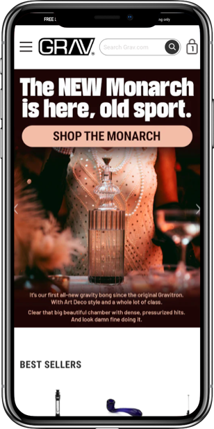
HYPOTHESIS 1: Surfacing known products earlier will reduce down-funnel confusion
Assumption
If we surface popular products and common replacement parts earlier in the funnel, users who arrive with a specific product in mind will reach the correct PDP faster and with less confusion.
Survey and behavioral data showed that over 60% of shoppers landed on the site already looking for a specific product or replacement part, yet many still struggled to confirm they were in the right place.
Experiment
Elevated high-intent products and replacement parts earlier in the experience
Reduced reliance on exploratory navigation for users with clear goals
Designed PDP entry points that validated intent before requiring deeper scanning
Primary metrics
Add-to-cart rate
PDP engagement depth
Revenue per Visitor
Result
Users reached commitment points more quickly, indicating improved alignment between user intent and page content.
Example of a Top Products module I designed in Figma and validated through A/B testing to surface high-intent products earlier and reduce down-funnel confusion.
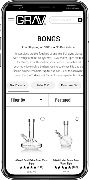
Hypothesis 2: Improving taxonomy will increase product findability and add-to-cart behavior
Assumption
If site taxonomy and labeling match the language users actually use, based on surveys, interviews, and external forums, users will locate the correct products faster and with less friction.
Research revealed that many users struggled to find specific products, not because they weren’t available, but because navigation terms and category structures didn’t reflect how users searched or described products.
Experiment
Refined taxonomy using language pulled directly from user survey responses, interviews, and community forums
Reduced ambiguity in category naming and product groupings
Aligned navigation labels more closely with high-intent search behavior
Primary metrics
Add-to-cart rate
Product discovery time
Reduced exits from category and PDP views
Result
Improved findability led to fewer dead ends and stronger forward momentum toward purchase.
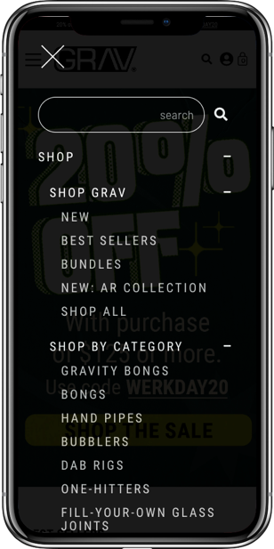
I iteratively tested updates to site taxonomy to better align with how users searched for and described products. This work included refining category and collection naming, restructuring product groupings, evolving navigation patterns, and introducing new categories that helped users quickly orient themselves and confirm they were in the right place.
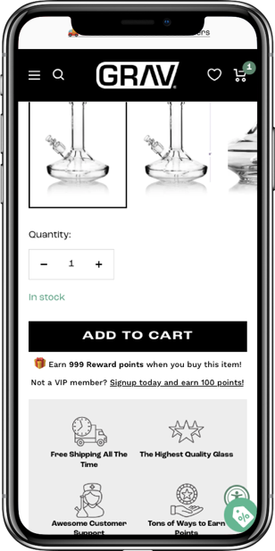
HYPOTHESIS 3: Clear product size information will increase purchase confidence
Assumption
If product size and scale are clearly communicated at the PDP, users will feel more confident adding products to cart.
Over 43% of surveyed users cited lack of size clarity as the primary reason they did not purchase, indicating a major confidence gap at the moment of decision.
Experiment
Prioritized size-related information higher in the PDP hierarchy
Reduced reliance on dense specification blocks in favor of scannable size cues
Clarified physical dimensions and compatibility earlier in the scroll experience
Primary metrics
Add-to-cart rate
PDP → cart progression
Result
Users committed earlier and more frequently, validating size clarity as a critical driver of confidence.

Over 80% of the product catalogue failed to provide product specs
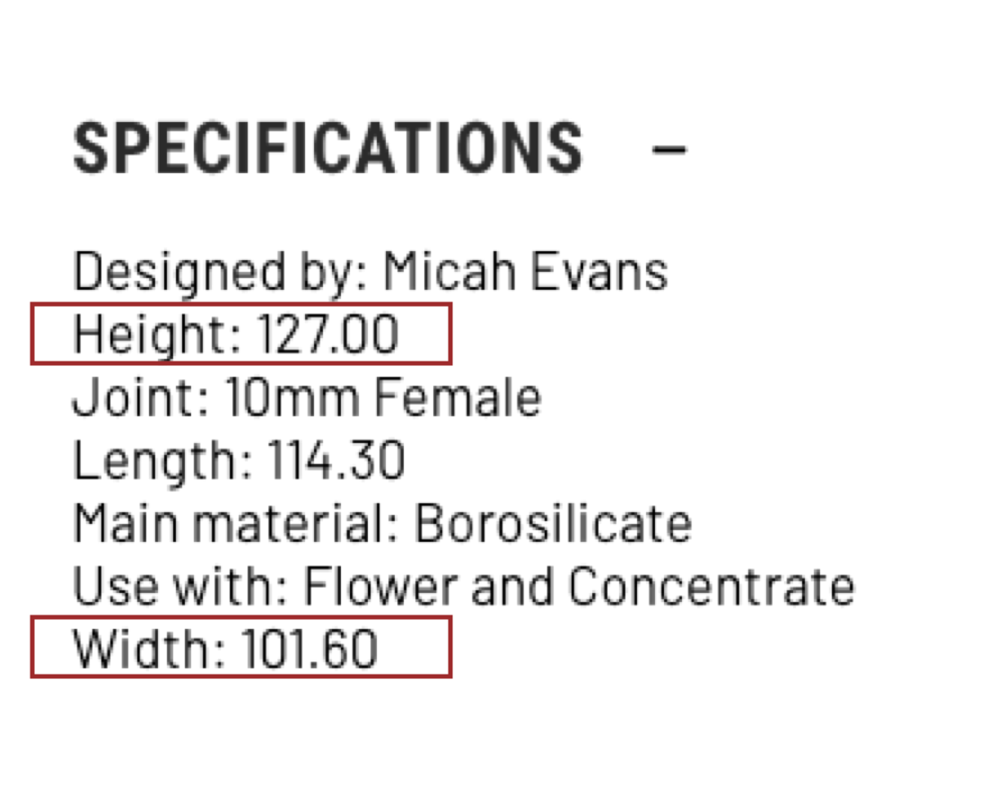
Portability, ease-of-concealment, and accessory compatibility were high-converting factors for most users

I designed and test new ways to surface key product Specs
HYPOTHESIS 4: Promoting loyalty and warranty signals will increase conversion for returning users
Assumption
If we surface loyalty benefits — such as points earned, rewards gained, and warranty information — at key decision moments, returning users will be more likely to complete purchases.
Data showed that returning users had the highest propensity to convert and frequently cited loyalty to the brand as a primary reason for purchase.
Experiment
Introduced clearer visibility into loyalty points and rewards near add-to-cart interactions
Highlighted warranty and post-purchase reassurance for repeat buyers
Reinforced value beyond price for users already familiar with the brand
Primary metrics
Conversion rate among returning users
Add-to-cart completion
Repeat purchase indicators
Result
Returning users showed stronger commitment signals, reinforcing loyalty as a meaningful conversion lever when surfaced at the right moment.
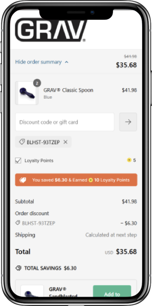
Data showed that users enrolled in the loyalty program converted at significantly higher rates, yet the program itself was under-surfaced across the experience. We designed and tested new ways to promote loyalty benefits at key decision points, with the goal of increasing revenue per visitor and average cart value among high-intent returning users.
WHY THIS APPROACH WORKED
Rather than treating the PDP as a static page, this approach treated the experience as a system built around user intent.
By addressing:
Findability before persuasion
Confidence before urgency
Retention before acquisition pressure
each experiment compounded on the last. This allowed improvements to scale across add-to-cart behavior, conversion, AOV, and downstream efficiency — without sacrificing brand integrity or over-relying on promotional tactics.
05 | KEY DECISIONS
1. Designed for known-intent users before optimizing for open-ended exploration
Decision
We optimized the experience around users who arrived with a specific product or replacement part in mind, rather than prioritizing exploratory browsing paths.
Tradeoff
This de-emphasized some discovery-focused navigation in favor of faster validation for high-intent users.
Why
Research showed that over 60 percent of users landed on the site already knowing what they were looking for. Helping them quickly confirm they were in the right place had a greater impact than adding more exploratory affordances.
Outcome
High-intent users reached the correct PDPs with fewer dead ends, contributing to stronger add-to-cart behavior.
2. Treated site taxonomy and navigation as primary growth levers
Decision
We restructured site taxonomy and navigation to better match how users searched for and described products, including updates to category naming, product groupings, and on-page navigation elements that guided users toward the right products.
Tradeoff
This required revisiting long-standing category structures and coordinating changes across navigation, collections, and PDP entry points.
Why
Survey responses, interviews, and forum research revealed consistent gaps between user language and the site’s existing taxonomy. Improving navigation clarity and alignment reduced findability friction more effectively than adding new comparison tools or decision aids.
Outcome
Users were more likely to find the correct products quickly and move forward in the funnel without getting stuck or abandoning search.
3. Prioritized clarity and intent validation over persuasion at the point of decision
Decision
We shifted the PDP approach away from urgency-driven tactics and focused instead on helping users clearly understand what they were buying, especially product size, fit, and whether they were on the right product or replacement part.
Tradeoff
This meant giving up some space traditionally used for promotional messaging near add-to-cart, which initially felt uncomfortable to some stakeholders.
Why
Both industry research and our own data pointed to the same thing. Users were not avoiding purchase, they were hesitating. Survey responses showed uncertainty around size and correctness was the biggest blocker, so improving clarity was more likely to drive confidence than adding pressure or discounts.
Outcome
Add-to-cart rates improved without leaning more heavily on promotions, confirming that confidence, not urgency, was the real unlock.
4. Used loyalty signals to reinforce confidence for returning users, not to persuade first-time shoppers
Decision
We surfaced loyalty benefits, rewards earned, and warranty reassurance selectively at key decision points rather than promoting loyalty messaging broadly across the experience.
Tradeoff
This limited the visibility of loyalty benefits for first-time users in favor of reinforcing confidence for returning shoppers who already had brand familiarity.
Why
Returning users had the highest propensity to convert and often cited loyalty to the brand as a reason for purchase. For these users, loyalty signals functioned as reassurance rather than persuasion.
Outcome
Returning users showed stronger add-to-cart and conversion behavior, validating loyalty as an effective confidence signal when introduced at the right moment.
5. Chose iterative experimentation over a single redesign to compound learning
Decision
Rather than betting on a full redesign, we treated the experience as something to improve incrementally through ongoing experimentation focused on navigation, taxonomy, findability, size clarity, and loyalty signaling.
Tradeoff
Progress was more gradual and required consistent measurement and stakeholder alignment.
Why
With a large catalog, high traffic, and a strong brand, smaller experiments reduced risk and allowed insights about user intent and behavior to compound over time instead of locking into one big decision.
Outcome
This approach led to sustained improvements across add-to-cart rate, conversion, RPV, and AOV.
06 | RESULTS & WHAT SHIPPED
WHAT SHIPPED
Instead of a single redesign, this work shipped as a series of validated, incremental improvements across navigation, PDPs, and decision-support patterns.
Key changes included:
Restructured site taxonomy and navigation to better match how users searched for and described products
Introduced clearer category naming, product groupings, and on-page navigation to help users quickly confirm they were in the right place
Surfaced popular products and common replacement parts earlier for users arriving with specific intent
Prioritized size, compatibility, and use-case clarity within PDPs to reduce hesitation at the point of decision
Refined add-to-cart context to reinforce confidence rather than urgency
Selectively surfaced loyalty benefits and warranty reassurance for returning users at key decision moments
All changes were rolled out incrementally, tested, refined, and expanded as results validated the direction.
RESULTS
Across the experimentation period, improvements to findability, clarity, and intent validation led to measurable gains across core growth metrics:
Increased add-to-cart rate, indicating higher purchase confidence
Improved conversion rate, driven by reduced hesitation and fewer dead ends
Lift in average order value as users felt more comfortable committing to higher-priced products
Revenue per visitor growth achieved without increasing promotional dependency
Reduced downstream friction, including fewer incorrect product selections and related support issues
Most importantly, these gains held over time, validating that the work addressed structural product issues rather than short-term optimizations.
WHY THIS WORKED
Performance gains did not come from pushing users harder to convert. They came from:
Designing for known intent before optimizing for exploration
Treating navigation and taxonomy as critical decision-support systems
Reinforcing clarity and confidence at the moment of commitment
Using loyalty as reassurance for returning users, not persuasion for everyone
Iterating through experimentation rather than locking into a single solution
Each improvement reduced friction at a different point in the journey, allowing results to compound as insights informed subsequent decisions.
KEY LEARNINGS
Many conversion problems are confidence and findability issues, not motivation issues
Optimizing for high-intent users often produces outsized gains without harming exploration
Language, naming, and structure can be as impactful as visual design
Loyalty is most effective when used to reinforce decisions, not create them
Sustainable growth comes from treating the experience as a system, not a set of isolated pages
WHAT I’D DO NEXT
Extend intent validation and decision-support patterns earlier in the funnel, especially within PLPs and collections
Introduce lightweight comparison cues for repeat or power users without adding UI complexity
Further tailor PDP content and loyalty signals based on user intent and returning behavior
Continue evolving taxonomy and navigation through experimentation as product lines expand
ABOUT ME

I am an accomplished Director of Optimization and UX Strategy with over 10+ years of expertise in UX/UI design, user research, and optimization.


Let’s Talk!
<BACK