IMPROVING BUYER CONFIDENCE AT GRAV

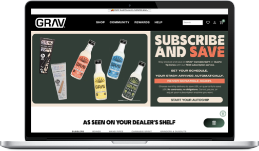
GRAV.COM
OVERVIEW
This case study covers a multi-year engagement with GRAV, where I led product design and experimentation across the eCommerce experience.
The work focused on improving product clarity, validating changes incrementally, and scaling successful patterns across PDPs, navigation, loyalty, and underlying systems. Experimentation was used as a design and risk-reduction tool to drive measurable improvements in conversion, revenue per visitor, and repeat behavior without compromising performance or brand equity.
PROJECT SCOPE
2023 - 2025
TL;DR
PROBLEM
While GRAV’s marketing effectively brought users to the site, many didn’t convert. Shoppers struggled to quickly understand which product was right for them, leading to hesitation around fit, compatibility, and overall value. Over time, layered fixes and third-party tools added friction and slowed the team’s ability to evolve the experience.
APPROACH
I led the optimization of GRAV’s entire eCommerce experience, treating the site as a product with an evolving roadmap. Insights from quantitative data, user research, and industry standards guided improvements across navigation, discovery, and purchase flows.
Early optimizations helped validate direction and reduce friction, which informed a full site retheme midway through the engagement. From there, the work continued to evolve through continuous refinement and insight discovery, allowing improvements to compound over time.
WHAT I DID
Led discovery by auditing funnels, PDP behavior, and end-to-end user journeys to identify breakdowns in confidence, clarity, and decision-making
Defined and tracked success metrics tied to product outcomes, including revenue per visitor, loyalty growth, NPS, return rate reduction, and measurable reductions in site complexity and technical debt
Owned the strategy, design, and validation of site-wide improvements across discovery, purchasing, PDPs, loyalty, and merchandising in close partnership with engineering, eCommerce, and marketing
Clarified product information at scale by standardizing measurements, improving compatibility data, and introducing visual size context to reduce hesitation
Refocused the experience on product-led decision signals over underperforming lifestyle content, prioritizing what demonstrably drove purchase confidence
Integrated loyalty and subscriptions directly into the shopping flow to support repeat behavior and long-term value
Improved underlying systems and product structure to reduce operational overhead and enable faster, safer iteration over time
IMPACT
Revenue per visitor increased by 11%, contributing to ~28% year-over-year revenue growth over the course of the engagement
Loyalty adoption and repeat purchasing improved as loyalty value became clearer and more integrated into the shopping flow, with returning customers accounting for ~34% of total revenue
Customer satisfaction (NPS) remained consistently positive throughout major changes to discovery, PDPs, and purchasing flows
Return rates decreased 21% following improvements to product clarity, sizing, and compatibility information
Reductions in site complexity and technical debt enabled faster iteration and lowered ongoing workload across marketing, design, development, and operations teams
WHY IT MATTERS
Rather than shipping isolated optimizations, this work focused on improving the underlying systems that supported product discovery, decision-making, and scale. By clarifying product information, aligning experiences to real purchase drivers, and reducing structural complexity, the team created a more durable foundation for growth.
TOOLS


INDEX:
01. Context & Constraints
02. Build a Scalable Baseline
03. Focus on What Drives Revenue
04. Prioritize Retention, Not Just Purchase
05. Design for Long-Term Scale
06 Impact & Reflections
CONTEXT & CONSTRAINTS
Product context
GRAV is an established eCommerce brand with a large, highly engaged customer base and a growing product catalog spanning multiple product lines, price points, and use cases. The business operates at meaningful scale, with ongoing product launches, seasonal demand, and a steady mix of new and returning customers.
Most traffic is mobile, and a significant portion of users arrive with clear intent and prior familiarity with the brand, placing high expectations on product clarity, decision confidence, and speed. Changes to the experience needed to perform reliably across a high-volume storefront without disrupting day-to-day revenue or operations.
Role
I operated as a Senior Product Designer embedded with the business, owning end-to-end discovery, design, and validation. In most cases, I acted as the sole designer, defining hypotheses, designing UX and UI solutions in Figma, and measuring impact in close partnership with eCommerce, marketing, creative, and engineering teams. Proposed changes often required working within established brand decisions and shared ownership across teams.
Engagement scope
The work followed an evolving roadmap informed by analytics, experimentation, and user feedback rather than a fixed plan. I led bi-weekly working sessions to review GA4 data, test results, and qualitative insights, which directly informed prioritization and what shipped next. When in-house design resources were present, the goal was to extend and strengthen existing systems; when they were not, I filled that role directly.
Key constraints
Several constraints meaningfully shaped both the sequencing of work and the design decisions throughout the engagement:
Shopify platform and extensibility limitations
The site was built on Shopify with a complex theme architecture and multiple third-party apps, creating constraints around extensibility and checkout customization. In some cases, desired checkout improvements were not fully supported even on Shopify Plus, requiring alternative design approaches that delivered similar outcomes without introducing fragility or app conflicts.Mobile-dominant traffic and performance sensitivity
Approximately 80% of traffic was mobile, making performance, content hierarchy, and speed critical. Site weight and script load required constant tradeoffs, and accessibility considerations were prioritized to support on-the-go usage.Regulatory constraints
Legal limitations prevented durability claims or publishing stress test data, requiring trust to be built through warranty positioning, care guidance, and clarity rather than performance assertionsShifting shopping behavior
Long-time customers remained highly loyal, while newer audiences increasingly compared products across multi-brand outlets, elevating the importance of loyalty, retention, and repeat valueRevenue-critical seasonality and risk management
Online headshops have a built-in seasonal peak around April 20th, requiring coordination with marketing, inventory, and promotions. Major structural changes, including a broader retheme, were intentionally delayed until after April 2023 to avoid interfering with revenue, fulfillment, or launch plans. As a result, improvements were shipped incrementally and validated continuously.Legal, compliance, and operational risk
Ongoing regulatory uncertainty around hemp-derived products, age verification, payment processing, marketing claims, shipping restrictions, and state-by-state compliance created constant operational friction. These constraints limited merchandising flexibility and required designs to accommodate age gating, regional shipping rules, and frequent adjustments to checkout and fulfillment flows.
PRODUCT STORY 1: BUILDING SCALABLE BASELINE
Over the course of the engagement, the work unfolded in a series of overlapping phases rather than a single linear redesign. Each product story reflects a shift in focus as new constraints surfaced and earlier improvements created room for the next set of decisions. Together, these stories show how the product evolved from establishing a reliable baseline for customer understanding to supporting long-term growth, retention, and scale.
The Problem Users Were Hitting
Funnel analysis, heatmaps, session recordings, and exit surveys revealed a consistent pattern across product pages. Users arrived with clear intent, interacted heavily with specs and imagery, and then left without adding products to cart.
The strongest signal came from spec interaction. Heatmaps and recordings showed users repeatedly opening specifications, pausing on size-related information, and switching between similar products. Surveys reinforced this behavior, with confusion around product size and compatibility cited as a primary reason for leaving.
This issue was most pronounced across bongs, bubblers, handpipes, and accessories — categories where physical scale and compatibility directly determine whether a product will work.
At the moment of decision, users were trying to answer a simple question:
Will this fit, and will it work with what I already own?
This was not a persuasion or visual design problem. It was a confidence gap created by inconsistent and unreliable product information.

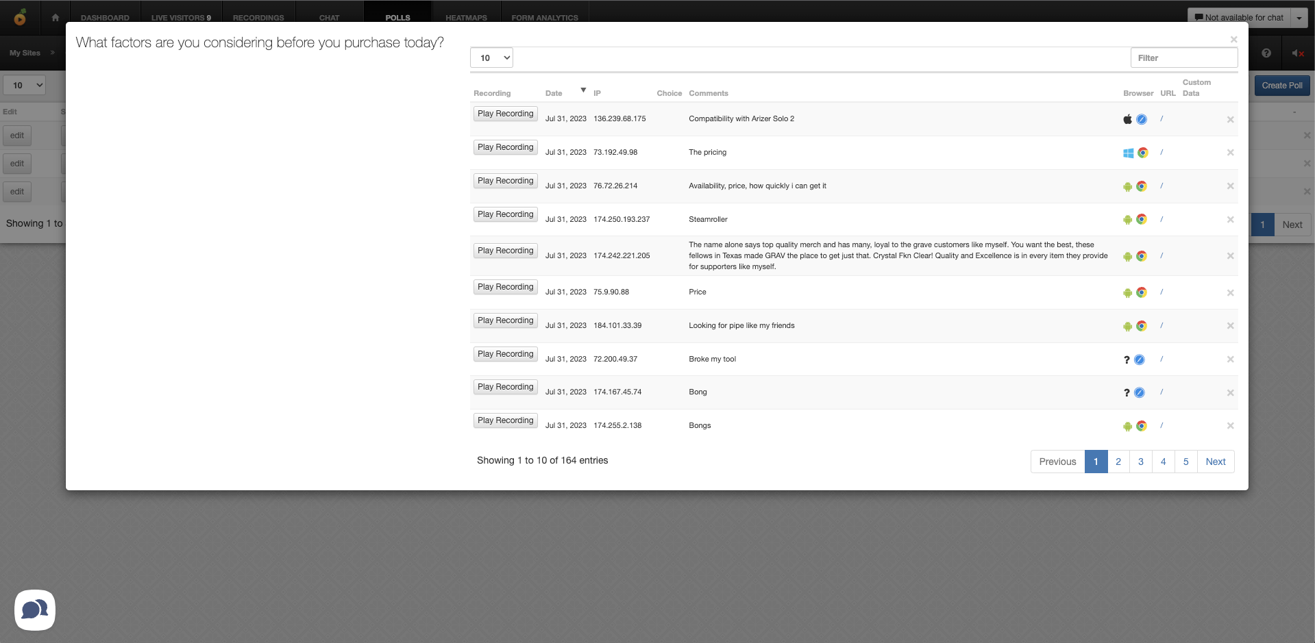
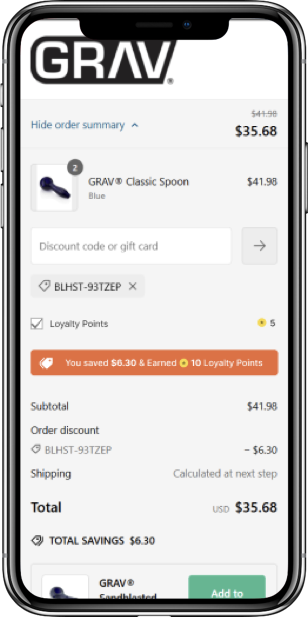
Funnel Analysis Using Google Analytics 4
What I Explored and Tested
Rather than treating this as a PDP design problem, I approached product understanding as a system issue.
Auditing the catalog revealed that over half of products were missing explicit size indicators such as centimeters or millimeters. In parallel, none of the sizing filters functioned reliably because product tags and metadata had not been consistently maintained. This meant users couldn’t confidently compare, filter, or validate fit — even when the information technically existed.
Behavioral data showed users compensating by opening specs repeatedly, switching between PDPs, or leaving the site entirely to look for confirmation elsewhere.
What I Learned
The core insight wasn’t about layout or copy.
Users prioritized size and compatibility above all other factors. When those signals were explicit, consistent, and easy to interpret, users moved forward. When they were vague, buried, or inconsistent, users stalled — regardless of interest or intent.
This reframed the problem entirely. Users didn’t need more explanation or comparison. They needed reliable, immediately legible confirmation.

Over 50% of the product catalogue failed to provide product specs
Portability, ease-of-concealment, and accessory compatibility were high-converting factors for most users
The Decision I Made
Based on these learnings, I led changes designed to establish a scalable baseline across the entire catalog.
We chose not to add longer descriptions or comparison tools. Instead, we focused on clarity at a glance.
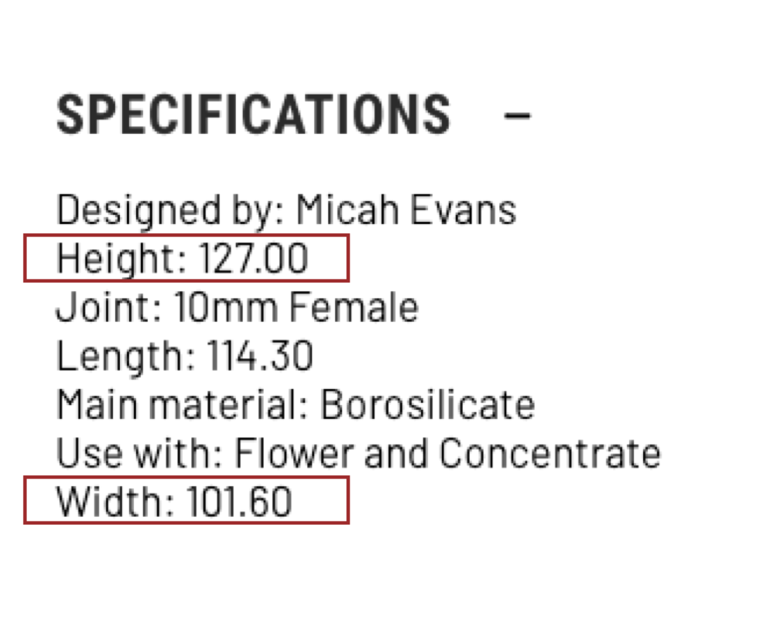
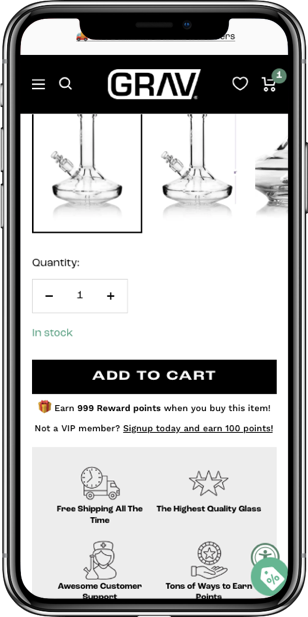
Product measurements were standardized across all PDPs, removing ambiguous labels and introducing explicit units. Specs were opened by default, while long descriptive paragraphs were deprioritized.
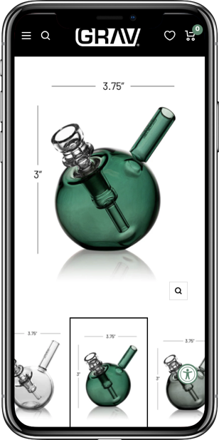
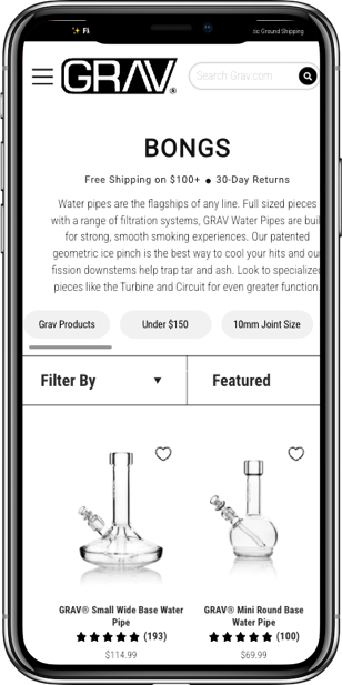
To support faster comprehension — especially for users browsing collection pages — product imagery was updated to include familiar reference objects, such as lighters, to communicate scale instantly without increasing cognitive load.
In parallel, I worked with engineering and the eCommerce team to clean up product tagging and compatibility data. While this required upfront effort, it enabled functional filters, accurate categorization, and more reliable discovery patterns. New processes were introduced to ensure future products included proper measurements and photography standards at launch.
Each decision prioritized consistency, accuracy, and repeatability over decoration or persuasion.

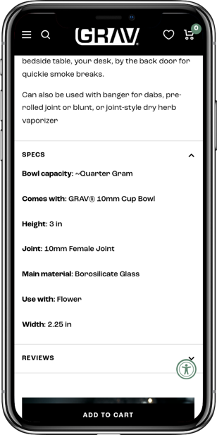
I designed new ways to surface key product Specs
Why This Mattered
Reduced decision hesitation at the point of purchase
Clear, consistent size and compatibility signals allowed users to evaluate products more confidently and reach add-to-cart faster, reducing reliance on guesswork or external validation.Delivered immediate, measurable performance gains
+36% increase in add-to-cart rate
+15% increase in conversion rate
+6% increase in revenue per visitor
Fewer product page views as users needed less back-and-forth to decide
Lowered downstream friction and operational cost
Improved clarity reduced return rates and customer service inquiries related to fit and compatibility.Established a scalable product information foundation
Standardized measurements, tagging, and compatibility data enabled more reliable filtering, merchandising, and navigation as the catalog grew.Unlocked future product and business decisions
This baseline made it possible to confidently refocus decision signals, support the 2023 retheme, and integrate loyalty messaging in high-impact areas of the experience.Shifted the product from page-level fixes to system-level design
Treating product understanding as infrastructure, rather than isolated PDP optimization, removed friction at scale and created durable leverage for long-term growth.
PRODUCT STORY 2: FOCUSING ON WHAT DRIVES REVENUE
The problem users were hitting
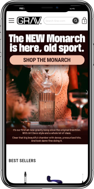
As the brand matured, increasing effort and budget were invested in lifestyle and video content across the site. The assumption was reasonable: video could help tell the brand story, demonstrate product use, and increase engagement, especially for newer customers.
In practice, performance data told a different story.
Across devices — and most notably on mobile — video content consistently underperformed. Add-to-cart rates declined, time on site increased without downstream conversion benefit, and load times suffered. In several cases, video placement displaced reviews and product details that users relied on for trust and validation.
This raised a more important question than whether the content looked compelling:
Was video actually helping users decide to buy?
What I Explored and Tested
Rather than relying on opinion or sunk cost, I worked with the team to test video content across nearly every high-intent surface in the experience, including the homepage, PDP image carousels, below product descriptions, and as larger feature callouts. Variations tested included placement, prominence, autoplay behavior, and supporting copy.
We deliberately excluded cart and checkout, but otherwise evaluated video broadly across the primary funnel.
At the same time, I monitored performance and behavioral data — particularly on mobile — to separate aesthetic appeal from decision-making impact. This included A/B testing, cohort analysis, and usability testing.
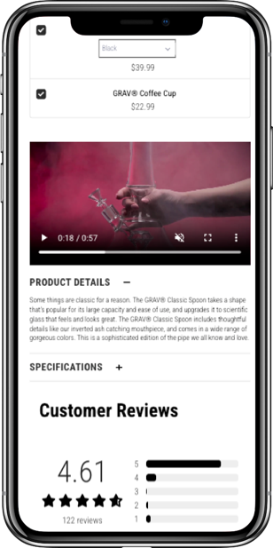
We tested multiple ways to showcase video content across the site.
What I Learned
Across most categories, the pattern was consistent: video did not meaningfully improve conversion or downstream engagement. In many cases, it introduced friction by slowing pages or competing with more critical product information.
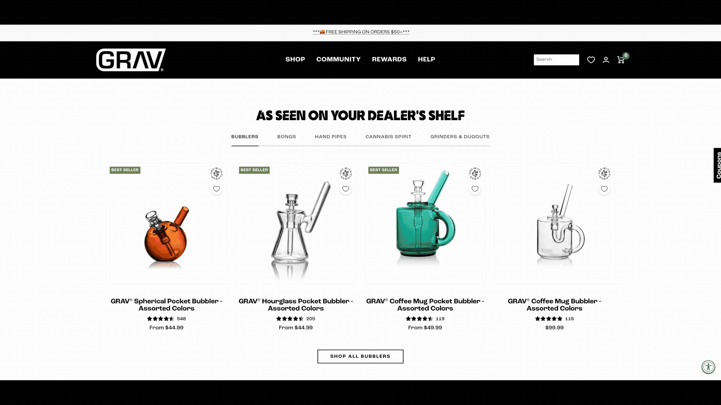
There were limited exceptions. Short, functional videos performed better on specific product types, such as bubblers that visually demonstrated airflow, and dab rigs where functionality was less familiar to casual users. Outside of these cases, however, video did not support confident decision-making.
More importantly, user behavior revealed that most customers did not need lifestyle storytelling. They were already familiar with the brand. What they needed was fast access to:
Product specifications
Compatibility and sizing
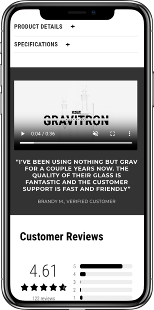
Reviews showing real-world use
Signals of quality, scarcity, or warranty
Promoting lifestyle content over product clarity was misaligned with how people were actually shopping.
The Decision I Made
Based on these findings, I made the call to deprioritize video content across high-intent surfaces, especially PDPs.
We explicitly said no to hero videos, autoplay treatments, and large lifestyle blocks that pushed critical information below the fold. Instead, we adopted a specs-first, story-after approach that prioritized clarity, performance, and decision confidence.
Video was intentionally retained only where it proved useful — on low-impact pages like About and Blog, and on a small number of PDPs where functional demonstrations showed clear value. During the later site redesign, video was intentionally excluded from new PDP templates despite existing investment, because the data did not support its impact on confidence or conversion.
This was a conscious tradeoff. We chose clarity, speed, and trust over perceived richness.
Some outlier products like bubblers and gravity bongs benefited from instructional or functional video content. (Example above)
Why This Mattered
Improved decision efficiency at the moment of purchase
Removing underperforming video reduced distraction and made critical product information easier to access.Strengthened product-led decision signals
PDPs emphasized specifications, compatibility, reviews, limited availability, and warranty — signals users actually relied on.Delivered performance and conversion gains
Page speeds improved and add-to-cart rates increased as heavy media was removed from high-intent surfaces.Enabled legally compliant trust-building
Highlighting GRAV’s six-month warranty provided a credible quality signal without overstating durability claims.Prevented misaligned future investment
Data-backed decisions helped the team pause further video spend and redirect effort toward product clarity and system improvements.Shifted internal culture toward experimentation
This work reinforced a test-and-learn mindset, leading more team members to bring ideas forward and engage in experimentation rather than relying on intuition alone.
Saying no here simplified the experience, protected performance, and ensured future work focused on what actually moved the product forward.
PRODUCT STORY 3: DESIGNING FOR RETENTION, NOT JUST PURCHASE
The problem users were hitting
As overall conversion improved, another pattern began to emerge in the data.
A meaningful portion of customers were returning to the site regularly, often to purchase the same types of products, yet engagement with the loyalty program and subscriptions remained low.
At first glance, this looked like a marketing problem. In reality, it was a product visibility problem.
Users were already behaving like loyal customers, but many were unaware of the benefits available to them or how those benefits fit into their purchasing flow.
What I explored and tested
To understand the gap, I looked at repeat purchase behavior alongside loyalty engagement and survey responses.
The data showed that many customers were returning at predictable intervals to purchase consumable or replenishable products such as cleaning supplies and fill-your-own packs. At the same time, surveys indicated that loyal users often did not realize they were earning points or eligible for rewards.
I reviewed where loyalty and subscription information appeared across the experience and found that it was either buried, inconsistently surfaced, or disconnected from moments of purchase intent.
Rather than treating loyalty as a promotional layer, I approached it as part of the core product experience.
What I learned
The issue was not a lack of interest in loyalty benefits.
Users were already loyal. They simply were not being shown the value in a way that felt relevant or timely.
When loyalty information appeared in isolation, it was easy to ignore. When it appeared in context, alongside products users already intended to purchase, it became meaningful.
This shifted the focus from acquiring more users to better supporting the ones already returning.
The decision I made
Based on these insights, I led a shift in how loyalty and subscriptions were integrated into the experience.
Rather than relying on standalone pages or generic messaging, we surfaced points earned, rewards, and savings directly within the shopping flow. This included product pages, cart, and post-purchase moments where users were already making value-based decisions.
We also aligned subscription offerings around products with clear repeat purchase behavior, making it easier for users to opt into predictable replenishment without added friction.
During the later redesign, this thinking informed a broader overhaul of the loyalty program. The goal was not just to promote rewards, but to make the value of returning obvious and easy to understand.
Data showed that users enrolled in the loyalty program converted at significantly higher rates, yet the program itself was under-surfaced across the experience. We designed and tested new ways to promote loyalty benefits at key decision points, with the goal of increasing revenue per visitor and average cart value among high-intent returning users.
Why this mattered
This work shifted the focus from optimizing single transactions to supporting long-term relationships.
Users were better able to recognize the value they were already earning, which increased engagement with loyalty features and reinforced repeat behavior.
From a product perspective, this strengthened lifetime value without relying on discounts or urgency tactics. It also gave internal teams a clearer framework for thinking about retention as part of the core experience, not an afterthought.
Designing for loyalty required fewer flashy changes, but it had a compounding impact over time.
STORY 4: DESIGNING FOR LONG-TERM SCALE
The problem users and teams were hitting
As the product matured, many usability issues were no longer isolated UX problems — they were symptoms of deeper system constraints.
The site was running on an older Shopify theme that relied heavily on third-party apps and custom code to meet basic UX requirements. Managing product SKUs, tags, and metadata had become increasingly fragile, filters were difficult to maintain, and performance suffered as complexity grew.
At the same time, the business needed to upgrade to Shopify 2.0, adopt checkout extensibility, improve site speed, and prepare for future expansion into consumables, wholesale, and additional revenue streams. Continuing to layer fixes on top of the existing foundation would have increased maintenance cost and risk.
While the site could have continued operating for several more years, both the client’s executive team and I recognized that the underlying system was the primary constraint holding the product back.
What I explored and tested
Alongside ongoing UX work, I partnered closely with engineering and eCommerce stakeholders to identify where tooling, data structure, and theme architecture were limiting progress.
We audited product tagging, filtering logic, navigation structure, and checkout behavior to understand which problems were rooted in UX and which were caused by platform limitations. In parallel, I evaluated opportunities to reduce complexity by consolidating functionality and leaning on native Shopify 2.0 features instead of layered apps.
This allowed us to assess potential changes not only by their immediate UX impact, but by how they affected long-term maintainability, performance, and velocity.
It became clear that improving the UI alone would not solve the core issues.
What I learned
Many of the most impactful UX improvements depended on having cleaner, more flexible underlying systems.
When product data was structured consistently, filters became usable. When navigation reflected how customers actually shopped — searching for specific pieces or browsing core categories — users found what they needed faster. When the theme supported core functionality natively, performance improved and reliability increased.
Design decisions that accounted for system health unlocked benefits well beyond individual pages.
The Decision I Made
Rather than continuing to optimize on top of an aging foundation, I helped guide the work toward a proactive retheme that formalized what we had already proven through research, testing, and iteration.
The redesign focused on durability over novelty. Key decisions included:
Rebuilding navigation to prioritize search and core product categories (bongs, bubblers, handpipes) over thematic collections
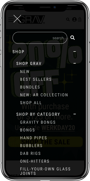
I iteratively tested updates to site taxonomy to better align with how users searched for and described products. This work included refining category and collection naming, restructuring product groupings, evolving navigation patterns, and introducing new categories that helped users quickly orient themselves and confirm they were in the right place.
Replacing underperforming apps, including migrating from Junip to Stamped.io to improve review visibility and user-generated content
Collaborating with the Creative Director to design new UI elements and page templates in Figma and Shopify’s code editor that standardized layout, specs, compatibility, and decision signals
Reducing reliance on third-party apps by leveraging native Shopify 2.0 features and custom-coded solutions where appropriate
Improving site speed and reliability by removing unnecessary custom code and simplifying theme architecture
I brought in an experienced Shopify developer I had worked with previously to support this work within budget constraints. I led prioritization, translated UX decisions into build-ready specifications, and sequenced development to minimize risk — starting with lower-impact pages and moving toward high-revenue surfaces last.
Throughout the redesign, I owned UX patterns, information architecture, PDP logic, and experimentation strategy, while collaborating closely with the client’s creative director on visual direction. Where tradeoffs arose, decisions were grounded in data and long-term product health rather than preference.
Why This Mattered
Locked in proven improvements at the system level
Clarity, decision signals, and data structure improvements from earlier work were formalized into reusable templates and patterns.Improved performance and decision efficiency
Site speed increased, add-to-cart rates improved, and users needed fewer page views to make confident purchases.Enabled safer experimentation and iteration
Cleaner architecture and standardized components made it easier to test new ideas without introducing fragility.Reduced operational overhead and internal friction
Product tagging, filtering, and navigation became easier to manage, reducing maintenance effort and internal debate.Created a foundation for future growth
The new system supported expanded loyalty efforts, subscription models, SEO improvements, and new product categories with minimal additional complexity.
The redesign wasn’t about changing how the site looked — it was about giving the product, and the teams behind it, a foundation that could scale with confidence.
IMPACT & REFLECTION
Impact
Over the course of this engagement, the product saw sustained improvements across both user experience and business performance.
Revenue per visitor increased by double digits year over year, with multiple periods showing ~11–12% RPV (revenue per visitor) growth while overall revenue grew by ~28% YoY
Conversion and add-to-cart behavior improved as product clarity increased, particularly for users landing directly on product pages, who converted ~40%+ more often and generated ~146% higher RPV than users landing on informational pages
Repeat behavior strengthened as loyalty and subscription value became more visible, with returning users accounting for ~34% of total revenue and generating ~6× higher RPV than new users
These gains were achieved while reducing reliance on discounts, indicating improvements were driven by product clarity and confidence rather than short-term incentives
Importantly, these improvements held over time, suggesting the work addressed underlying product and system issues rather than isolated optimizations.
Reflection
This project reinforced the value of treating experimentation as a design and risk-reduction tool rather than a substitute for product thinking.
Rather than optimizing individual pages in isolation, the focus was on identifying where user confidence broke down, validating solutions incrementally, and scaling what worked across the system.
It also highlighted the importance of designing within real constraints. Protecting revenue, respecting brand equity, and collaborating across teams required restraint as much as creativity.
The outcome was not just a stronger customer experience, but a more flexible, maintainable product foundation that teams could continue to evolve with confidence.
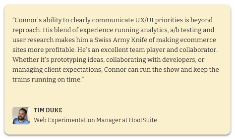
ABOUT ME

I am an accomplished Director of Optimization and UX Strategy with over 10+ years of expertise in UX/UI design, user research, and optimization.


Let’s Talk!
<BACK