
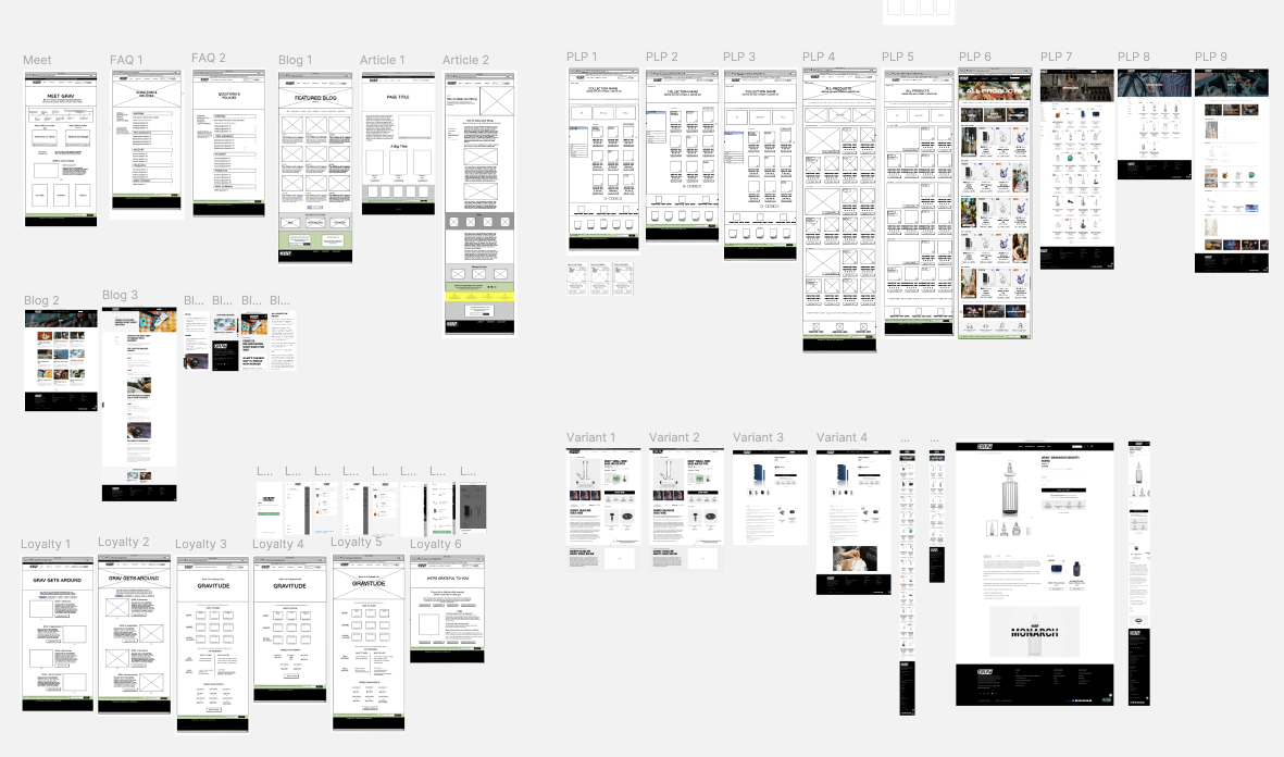
REDESIGNING
GRAV FOR SCALE
OVERVIEW
This case study covers a multi-year engagement with GRAV, where I led product design and experimentation across the eCommerce experience.
GRAV is an established glassware brand with a large, highly engaged customer base and a growing product catalog spanning multiple product lines, price points, and use cases.
PROJECT SCOPE
2023 - 2025
TL;DR
PROBLEM
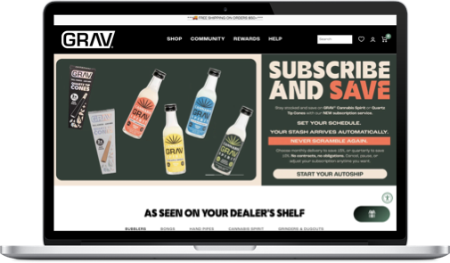
While GRAV’s marketing effectively brought users to the site, many didn’t convert. Shoppers struggled to quickly understand which product was right for them, leading to hesitation around fit, compatibility, and overall value. Over time, layered fixes and third-party tools added friction and slowed the team’s ability to evolve the experience.
APPROACH
I audited the entire eCommerce experience with product and marketing teams to identify the biggest opportunities. This allowed me to create a baseline as I iteratively designed and tested multiple improvements over 2 years, culminating in compounded revenue growth, less site maintenance, and consistent positive user feedback.
IMPACT
📈 +11% RPV, driving ~28% YoY revenue growth
🎯 +34% revenue from returning customers via Loyalty Program
😊 Positive NPS maintained through major UX and flow changes
📦 –21% return rate through better product and sizing clarity
🛠️ Lower technical debt, enabling faster iteration across teams
RESULTS
This work focused on improving the underlying systems that supported product discovery, decision-making, and scale. By clarifying product information, aligning experiences to real purchase drivers, and reducing structural complexity, the team created a more durable foundation for growth.
TOOLS


CONTEXT & CONSTRAINTS
PRODUCT CONTEXT
GRAV operates a high-volume eCommerce storefront where most traffic is mobile and many shoppers arrive with clear intent and prior familiarity with the brand. Users expect to quickly understand which product is right for them, with confidence around fit, compatibility, and value. Any changes to the experience needed to be fast, reliable, and low-risk, supporting day-to-day revenue while scaling with the business.
ROLE
I worked as a Senior Product Designer embedded with the business, owning discovery, design, and validation end to end. I led bi-weekly reviews to guide what shipped next, filling design gaps when needed and extending existing systems when available.
Much of the work required navigating existing brand decisions and shared ownership across teams.
KEY CONSRAINTS
Several constraints meaningfully shaped both the sequencing of work and the design decisions throughout the engagement:
Platform limitations: Complex Shopify theme and third-party apps limited extensibility and checkout customization, requiring durable, low-risk design solutions
Mobile-first performance: Roughly 80% of traffic was mobile, making speed, hierarchy, performance, and accessibility critical
Regulatory restrictions: Legal limits on product claims and stress-test data required trust to be built through clarity, warranties, and care guidance
Regulatory restrictions: Legal limits on product claims and stress-test data required trust to be built through clarity, warranties, and care guidance
Seasonality and risk: Revenue peaks around April 20th constrained timing for major changes, pushing a phased, incremental rollout strategy
Compliance complexity: Ongoing uncertainty around age gating, payments, shipping, and state-level rules required flexible, adaptable checkout and fulfillment flows
PRODUCT STORIES

Over the course of the engagement, the work unfolded in a series of overlapping phases. Each product story reflects a shift in focus as new constraints surfaced and earlier improvements created room for the next set of decisions. Together, these stories show how the product evolved from establishing a reliable baseline for customer understanding to supporting long-term growth, retention, and scale.
Product Story 1:
Building a Baseline

Product Story 2:
Focusing on What Works

Product Story 3:
Designing for Retention

BUILDING A
SCALABLE BASELINE
PRODUCT STORY 1
The Problem Users Were Hitting
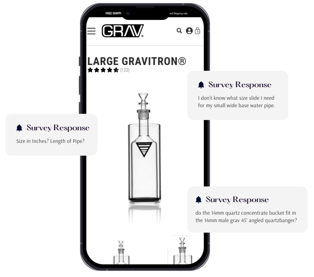
Funnel analysis, revealed a consistent pattern across product pages. Users arrived with clear intent, showed high engagement, and then left without adding products.
The strongest signal came from spec interaction. Heatmaps and recordings showed users repeatedly opening specifications, pausing on size-related information, and switching between similar products.
What I Explored
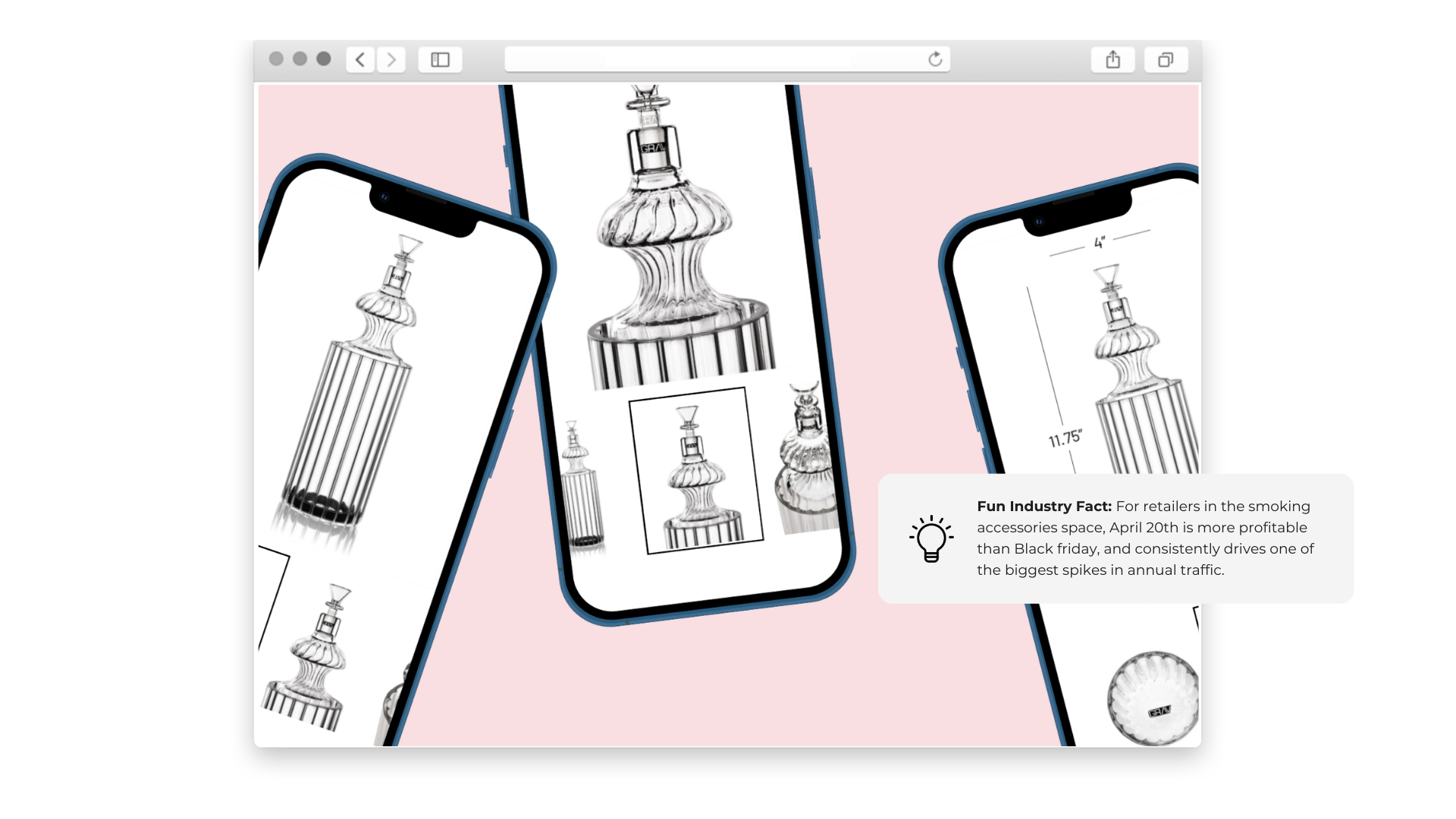
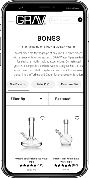
Auditing the catalog revealed that over half of products were missing explicit size indicators such as centimeters or millimeters. In parallel, none of the sizing filters functioned reliably because product tags and metadata had not been consistently maintained. This meant users couldn’t confidently compare, filter, or validate fit.


Nearly 80% of the product SKUs failed to provide adequate product spec.
What I Learned
The core insight was that users prioritized size and compatibility above all other factors. User surveys revealed that nearly 43% of all users leaving the product page claimed to be missing key size details.
The Decision I Made
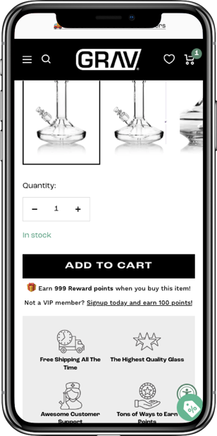
Based on these learnings, product measurements were standardized across all PDPs. Specs were opened by default and long descriptive paragraphs deprioritized.
To support faster comprehension, product imagery was updated to include familiar reference objects, such as lighters, to communicate scale instantly without increasing cognitive load. In parallel, I worked with engineering and the eCommerce team to clean up product tagging and compatibility data and introduce new processes to ensure future products included proper measurements and photography standards at launch.
Why This Mattered
Delivered immediate, measurable gains:
+36% add-to-cart rate
+15% conversion rate
+6% revenue per visitor
Made size and compatibility clear at the point of purchase, reducing friction, lowering return rates and customer service inquiries
Established a scalable foundation through standardized measurements, tagging, and compatibility data
Enabled more reliable filtering, merchandising, and navigation as the catalog grew
Shifted optimization from page-level fixes to system-level
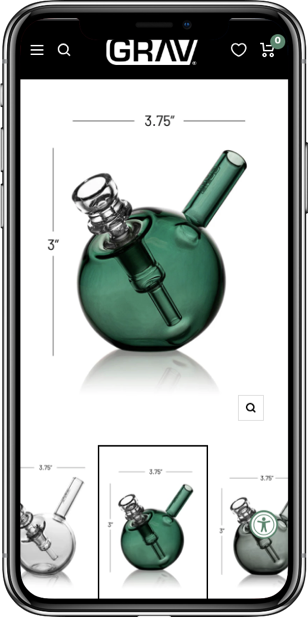

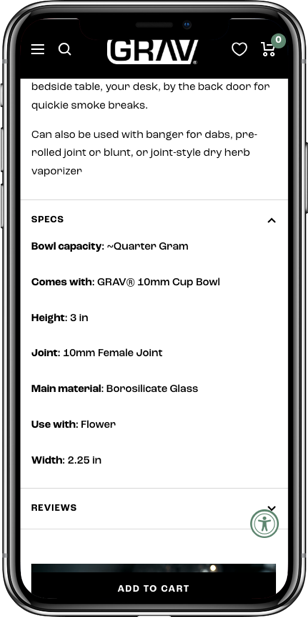
I designed new ways to surface key product Specs
PRODUCT STORY 2
FOCUSING ON WHAT DRIVES REVENUE
The Problem Users Were Hitting
As GRAV invested more in lifestyle and video content, performance data revealed a mismatch between engagement and conversion. Video reduced add-to-cart rates, slowed load times, and displaced reviews and product details. Did videos actualy help users decide?
What I Explored and Tested
I tested video across high-intent surfaces including the homepage, collection pages, and PDPs, varying placement, prominence, and behavior. Performance was evaluated through A/B testing, behavioral data, and usability research, with a focus on isolating decision impact on mobile.
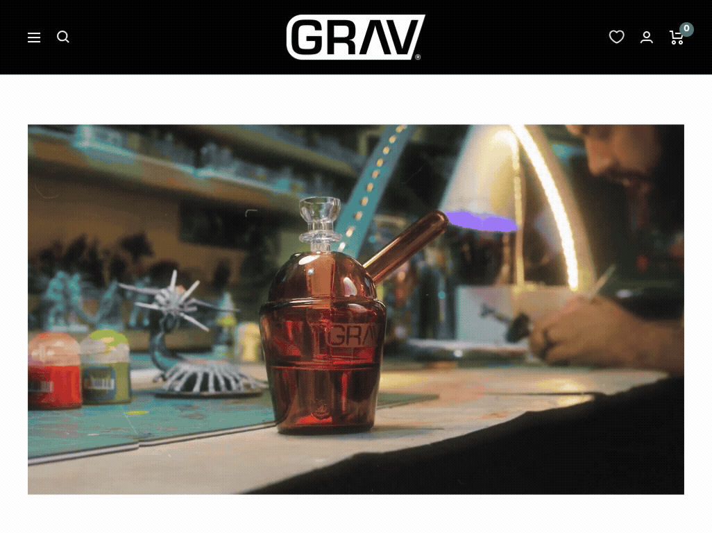
Lifestyle video did not support confident purchase decisions. Users prioritized fast access to specs, compatibility, reviews, and trust signals over storytelling.
What I Learned
Video rarely improved conversion and often added friction by slowing pages or competing with critical product information. Outside of a few functional use cases, lifestyle video did not support confident purchase decisions. Users prioritized fast access to specs, compatibility, reviews, and trust signals over storytelling.
The Decision I Made
I deprioritized video across high-intent surfaces, especially PDPs, adopting a specs-first, story-after approach. Video was retained only where it clearly improved understanding and was excluded from new PDP templates despite prior investment.

Why This Mattered
+20% mobile add-to-cart rate after removing underperforming video and reducing distraction
Down-funnel lift across all devices, indicating stronger decision confidence beyond the PDP
+5% revenue per visitor (RPV) driven by faster pages and clearer product signals
Clearer PDPs that prioritized specs, compatibility, reviews, availability, and warranty
Data-backed decisions that prevented misaligned video investment and reinforced experimentation
Some outlier products like bubblers and gravity bongs benefited from instructional or functional video content.
DESIGNING FOR RETENTION AND GROWTH
PRODUCT STORY 3
The problem users were hitting
As conversion improved, data revealed a connected set of constraints. Returning customers behaved like loyal users, but engagement with loyalty benefits remained low. At the same time, an aging Shopify theme and app-heavy architecture limited how loyalty, reviews, and repeat-purchase signals could be surfaced within high-intent flows.
What appeared to be marketing gaps were ultimately product and system limitations. Incremental UX improvements were no longer sufficient to support retention or scale.
What I explored and tested
I analyzed repeat purchase behavior, loyalty engagement, and survey data, alongside audits of navigation, filtering, tagging, review placement, and theme architecture. Working with engineering and eCommerce stakeholders, we identified which issues stemmed from UX execution versus platform constraints.
Incremental improvements were no longer sufficient to support retention or scale. A full retheme & redesign needed to happen.
What I Learned
It became clear that retention, loyalty visibility, and review integration depended on a stronger underlying system.
The Decision I Made
Rather than continue optimizing on top of a fragile foundation, I helped guide a proactive retheme to Shopify 2.0 that formalized what research and experimentation had already validated.
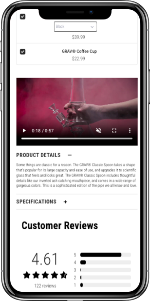
The redesign prioritized durability and scalability. Navigation and taxonomy were rebuilt around how users shopped, review visibility was improved through a migration to Stamped.io, third-party dependencies were reduced, and PDP templates were standardized to better support decision-making and repeat behavior.
This work also enabled a redesigned loyalty program with clearer point systems and benefits integrated directly into the shopping flow.
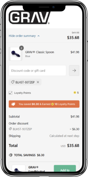
The retheme allowed for us to launch a new loyalty and reward programs along with other projects that had been de-prioritized due to an outdated theme architecture.
Why this mattered
Locked in proven UX and retention improvements at the system level
Enabled clearer loyalty value and review visibility in high-intent moments
Improved performance, decision efficiency, and conversion behavior
Reduced operational overhead and ongoing maintenance risk
Created a scalable foundation for loyalty expansion, subscriptions, and future growth
The retheme wasn’t about visual change. It removed the constraints limiting retention and long-term product growth.

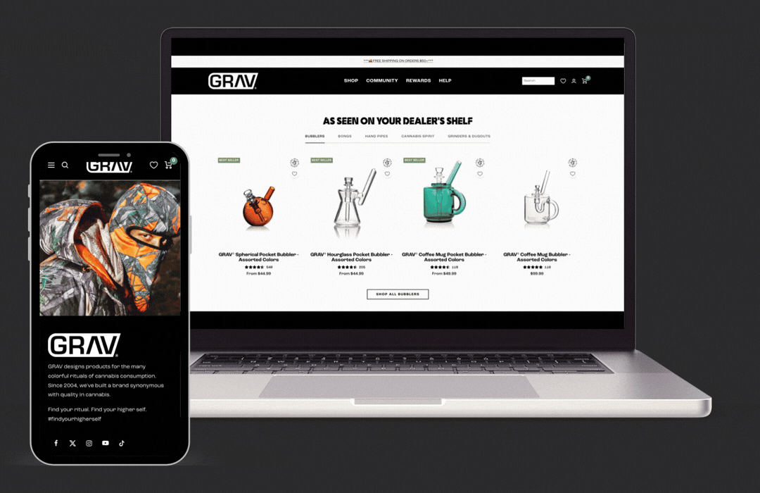
Screenshots from the Redesigned Site.
IMPACT & REFLECTION
Impact
Over the course of this engagement, the product saw sustained improvements across both user experience and business performance.
Revenue per visitor increased by double digits year over year, with multiple periods showing ~11–12% RPV (revenue per visitor) growth while overall revenue grew by ~28% YoY
Conversion and add-to-cart behavior improved as product clarity increased, particularly for users landing directly on product pages, who converted ~40%+ more often and generated ~146% higher RPV than users landing on informational pages
Repeat behavior strengthened as loyalty and subscription value became more visible, with returning users accounting for ~34% of total revenue and generating ~6× higher RPV than new users
These gains were achieved while reducing reliance on discounts, indicating improvements were driven by product clarity and confidence rather than short-term incentives
Importantly, these improvements held over time, suggesting the work addressed underlying product and system issues rather than isolated optimizations.
Reflection
This project reinforced the value of treating experimentation as a design and risk-reduction tool rather than a substitute for product thinking.
Rather than optimizing individual pages in isolation, the focus was on identifying where user confidence broke down, validating solutions incrementally, and scaling what worked across the system.
It also highlighted the importance of designing within real constraints. Protecting revenue, respecting brand equity, and collaborating across teams required restraint as much as creativity.
The outcome was not just a stronger customer experience, but a more flexible, maintainable product foundation that teams could continue to evolve with confidence.
ABOUT ME

I am an accomplished Director of Optimization and UX Strategy with over 10+ years of expertise in UX/UI design, user research, and optimization.


<BACK
Let’s Talk!